Article
Graphical Analysis
Create a graphical analysis easily and conveniently
QSuite lets you create different types of charts for your analyses. Each chart can be configured to meet your needs.
Introduction
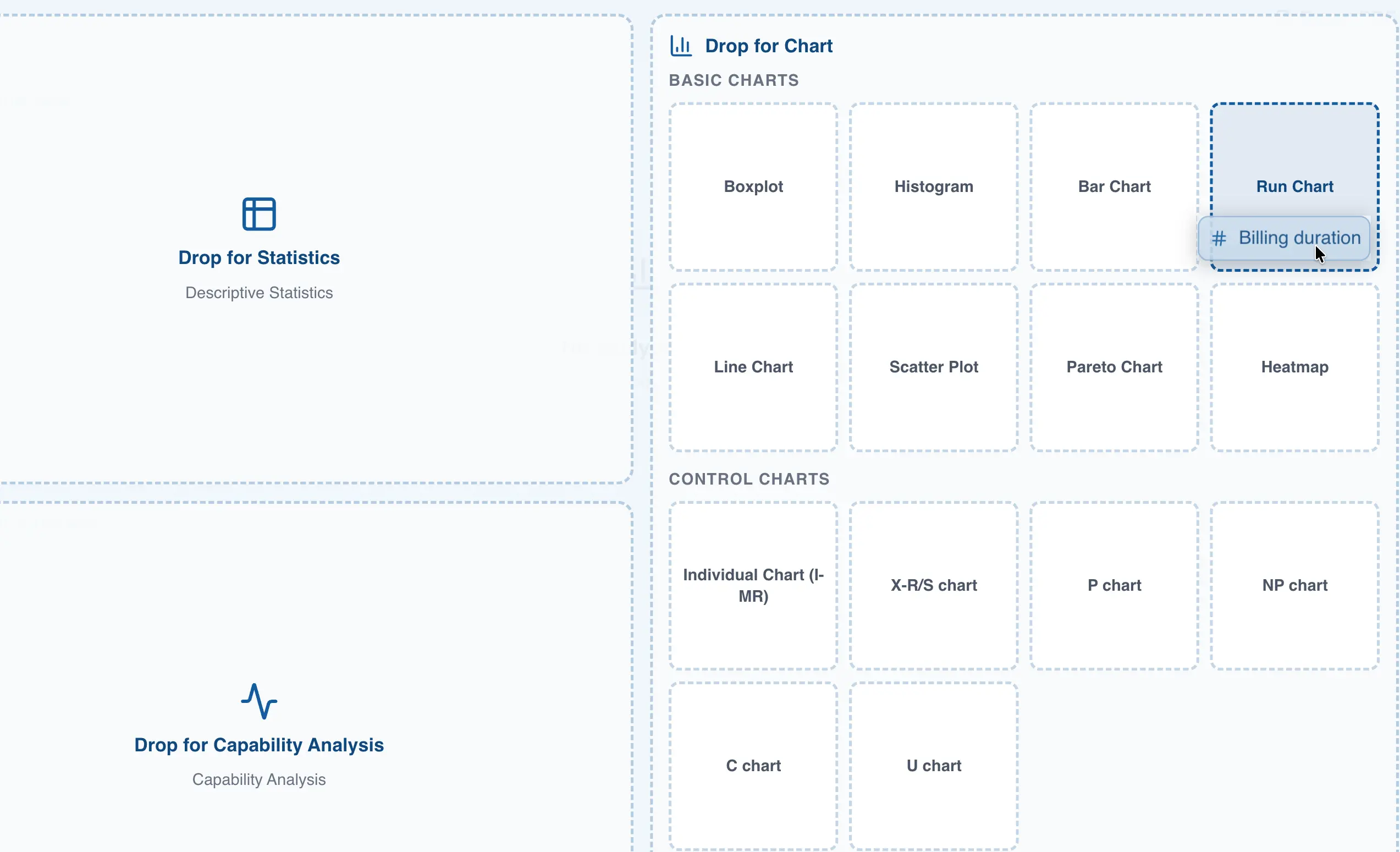
Creating a new chart from the menu bar
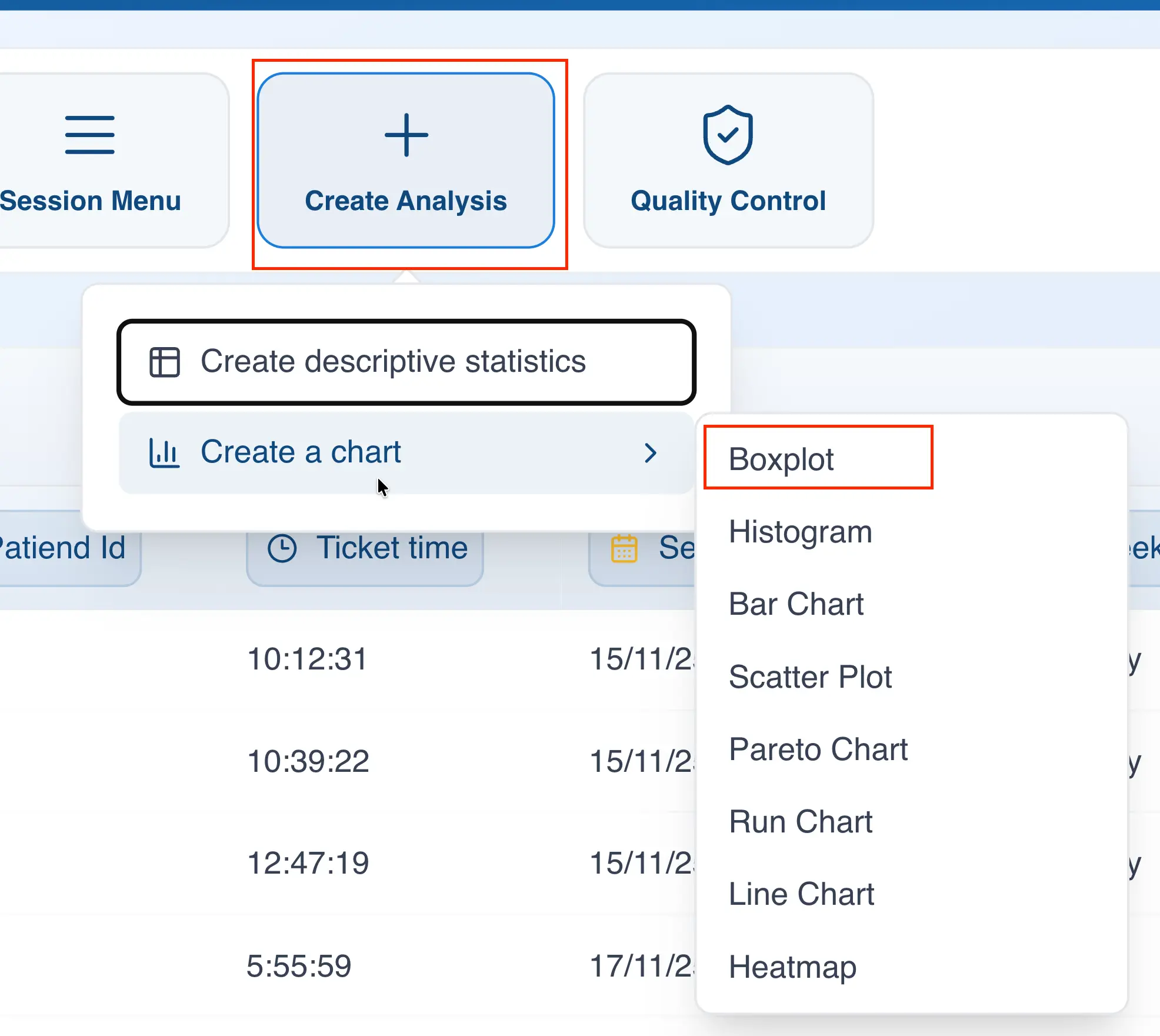
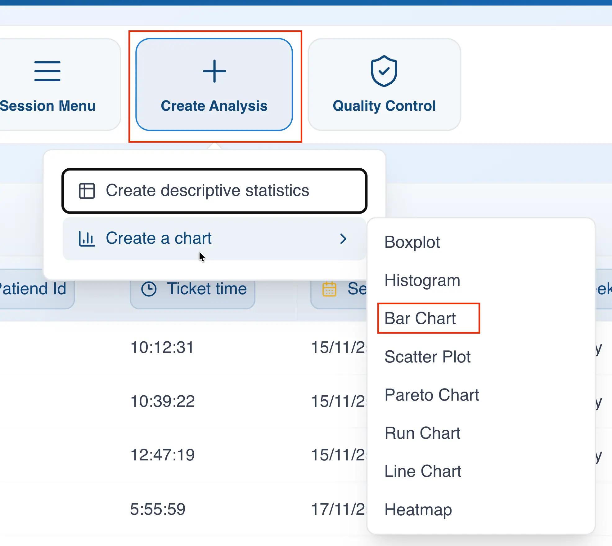
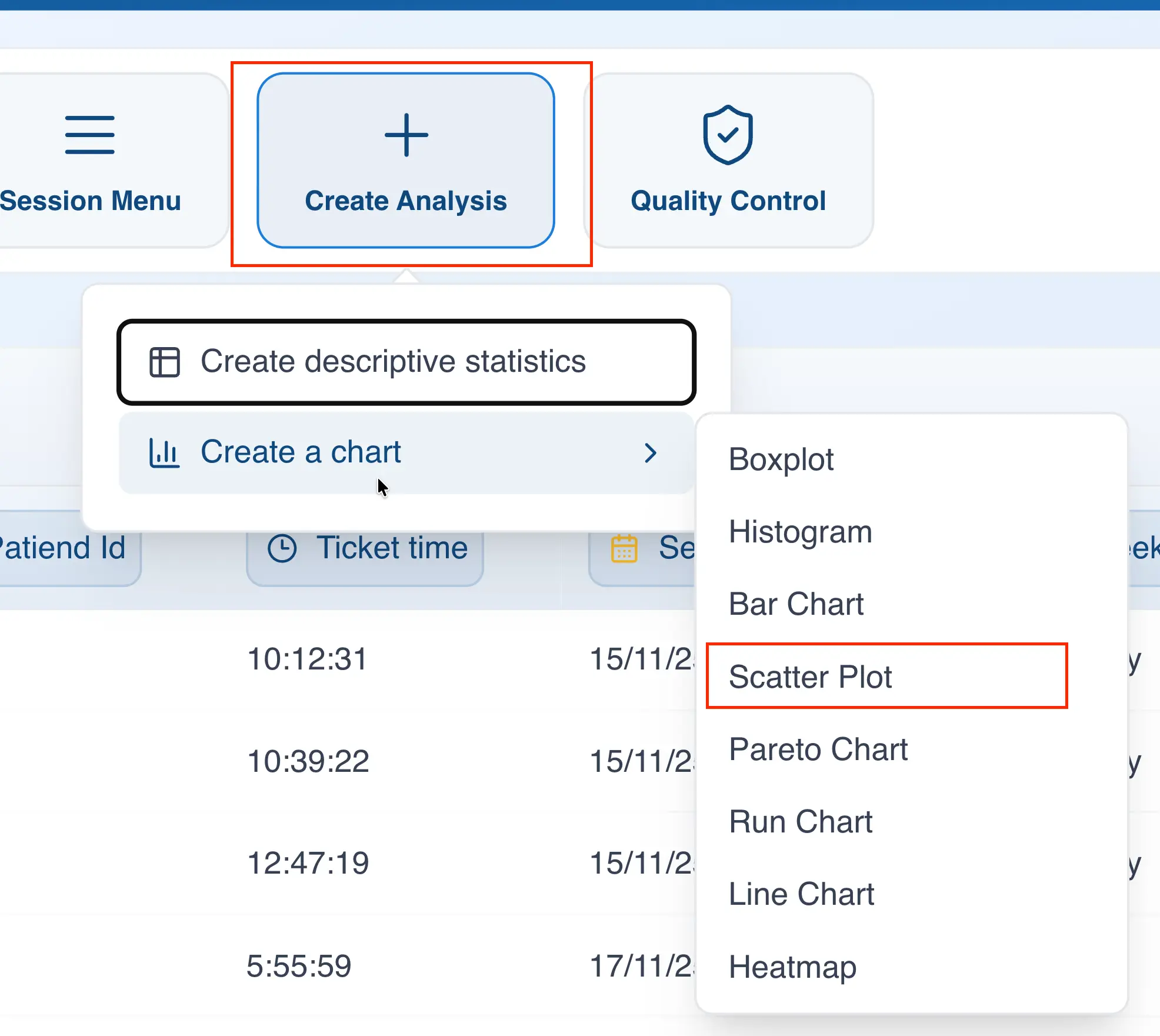
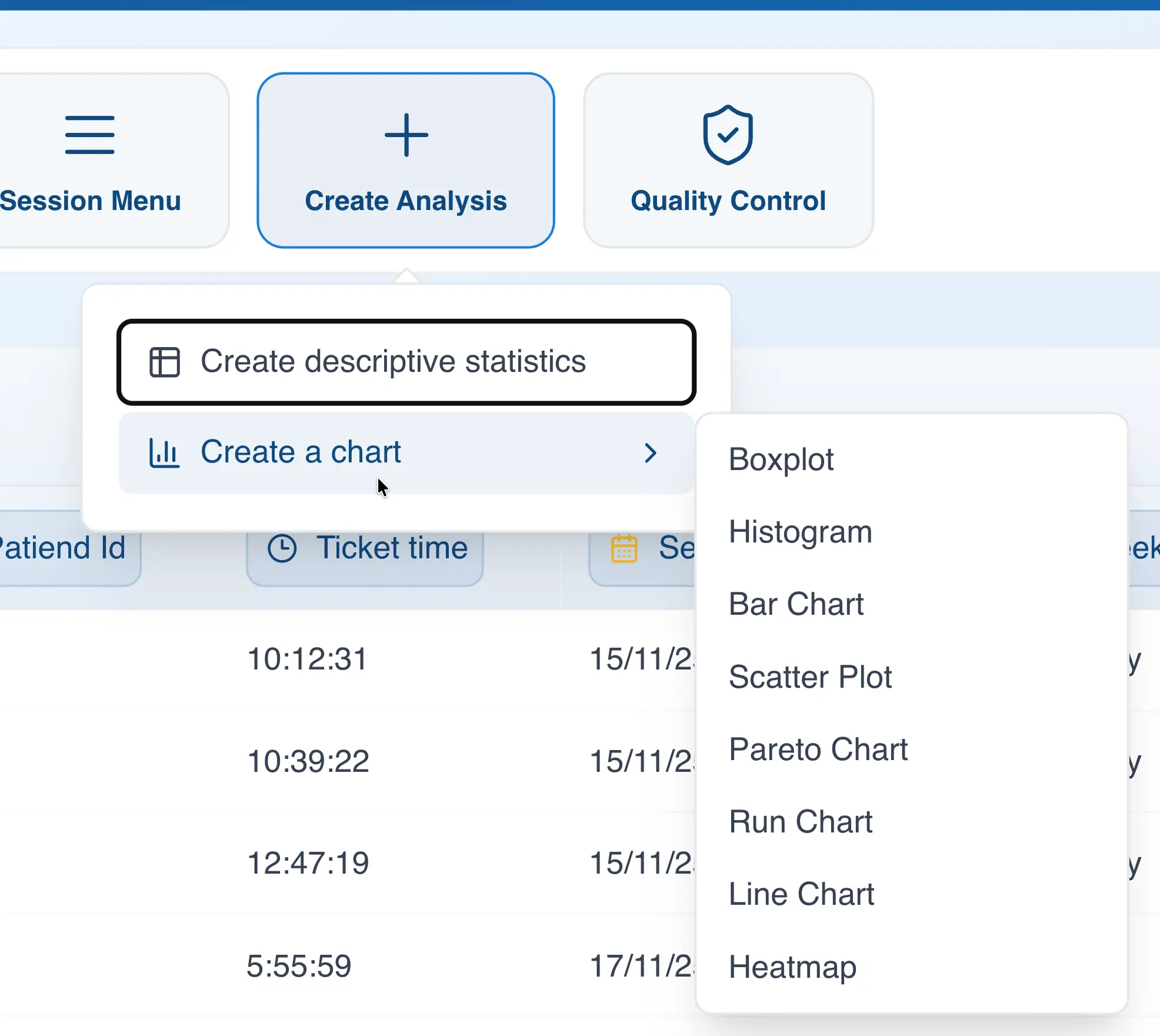
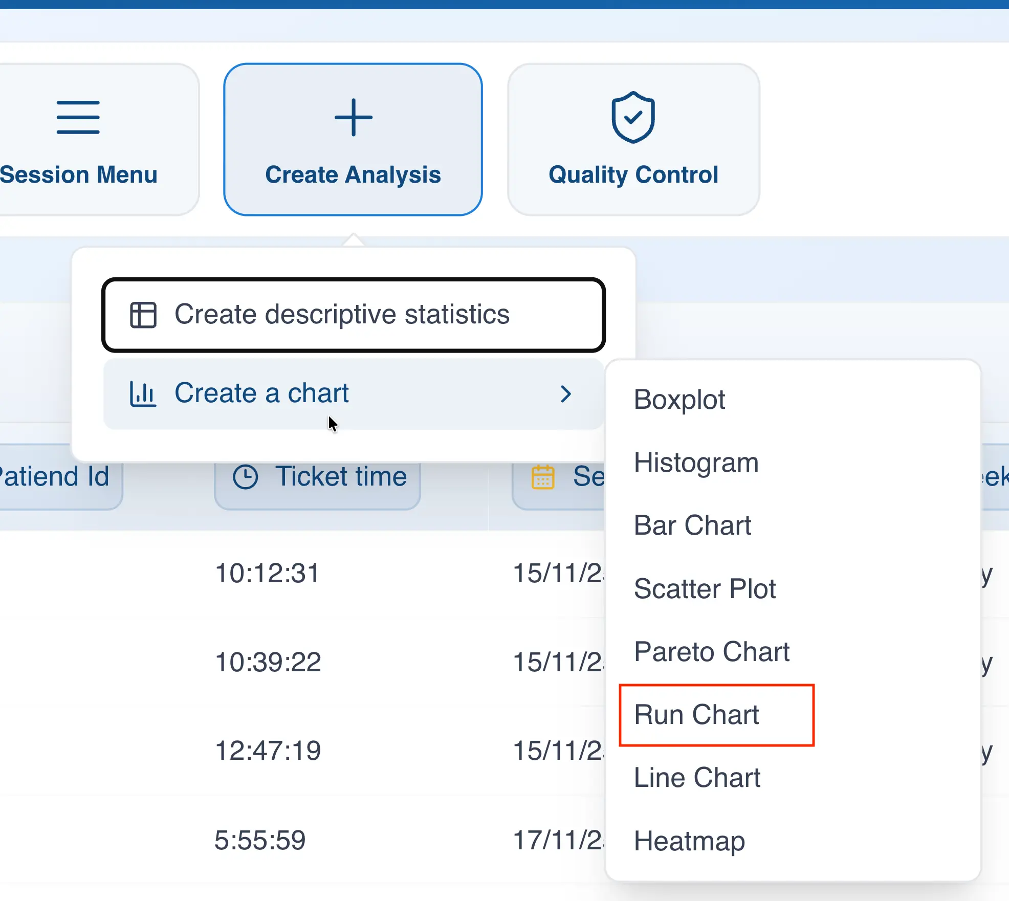
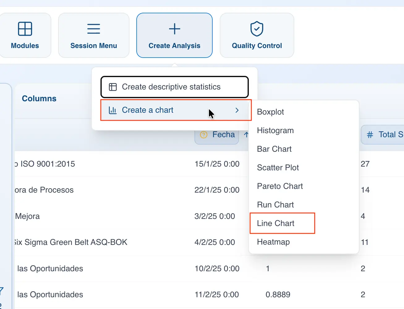
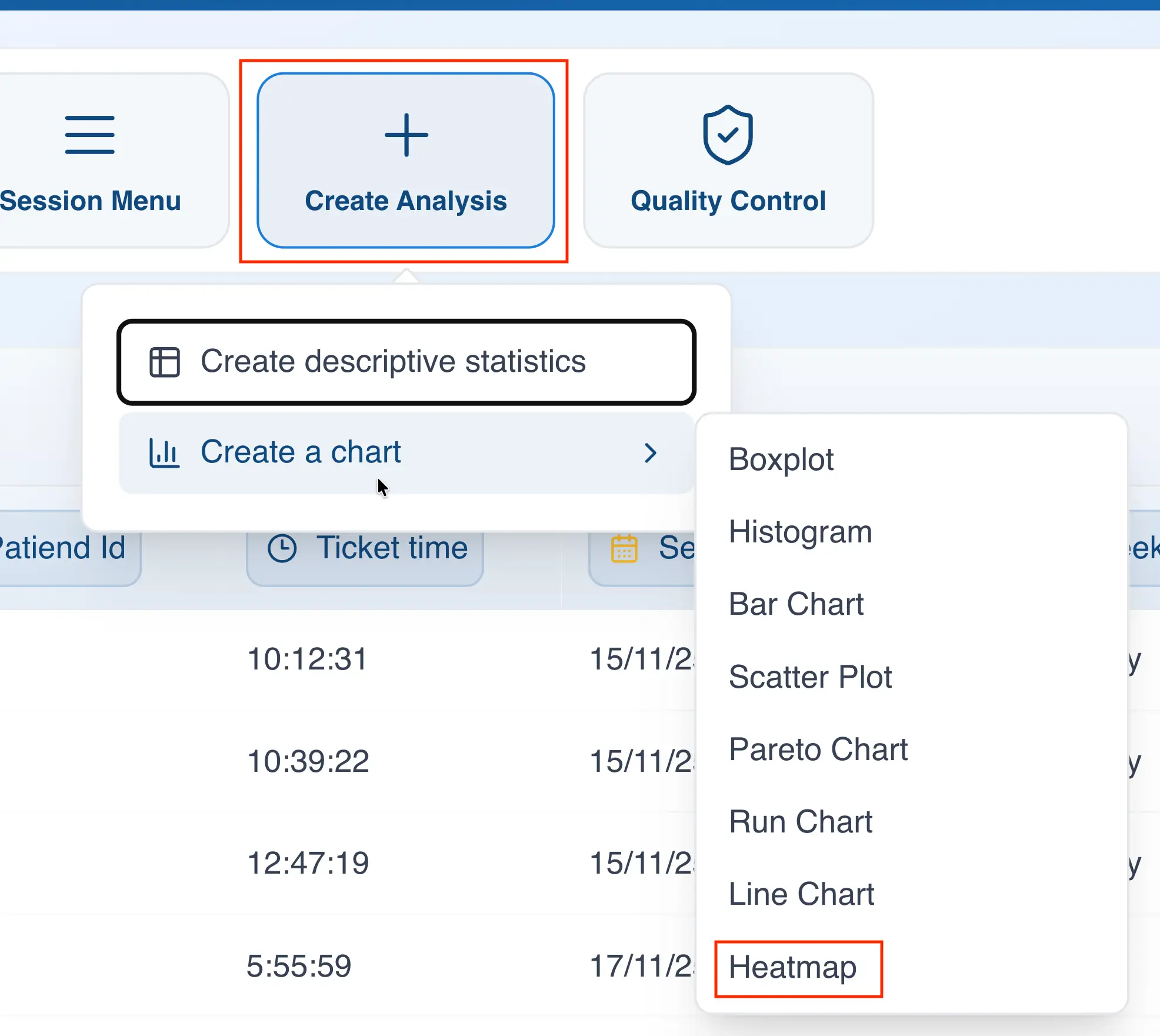
To create a chart from the menu bar, follow these steps:
- Click on "Create Analysis"
- Hover over "Create a Chart"
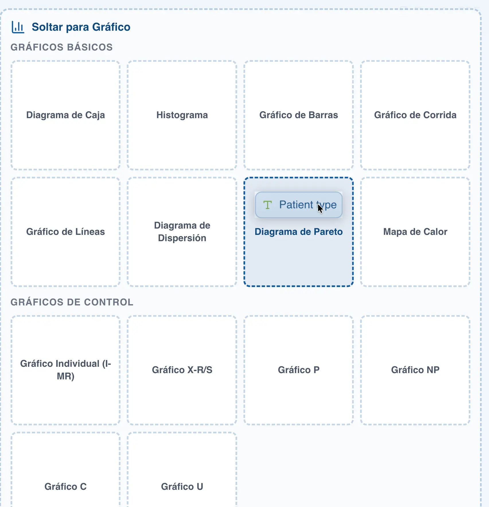
- Select the chart type you want to create
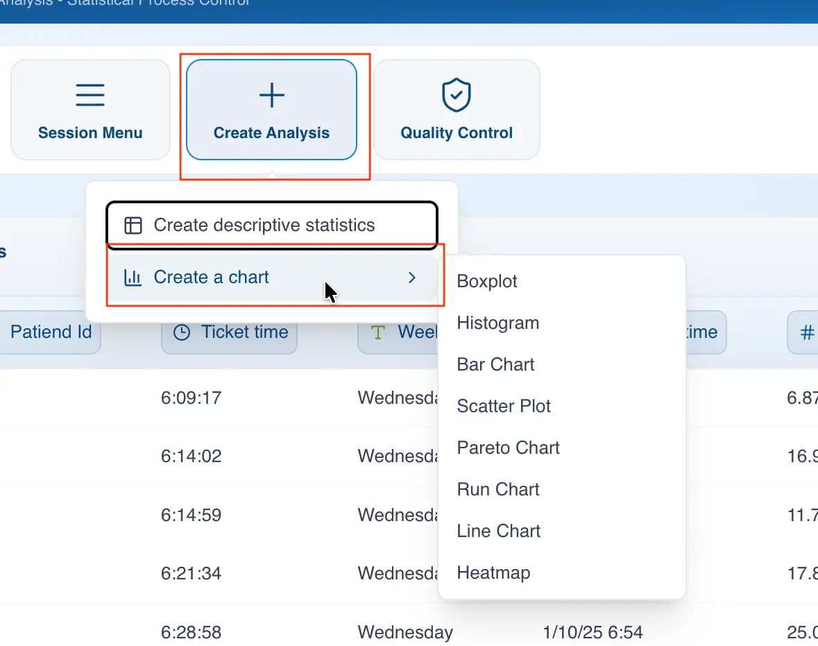
Clicking on the chart type will open the configuration panel.
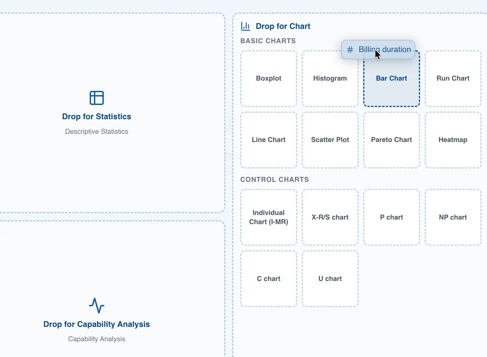
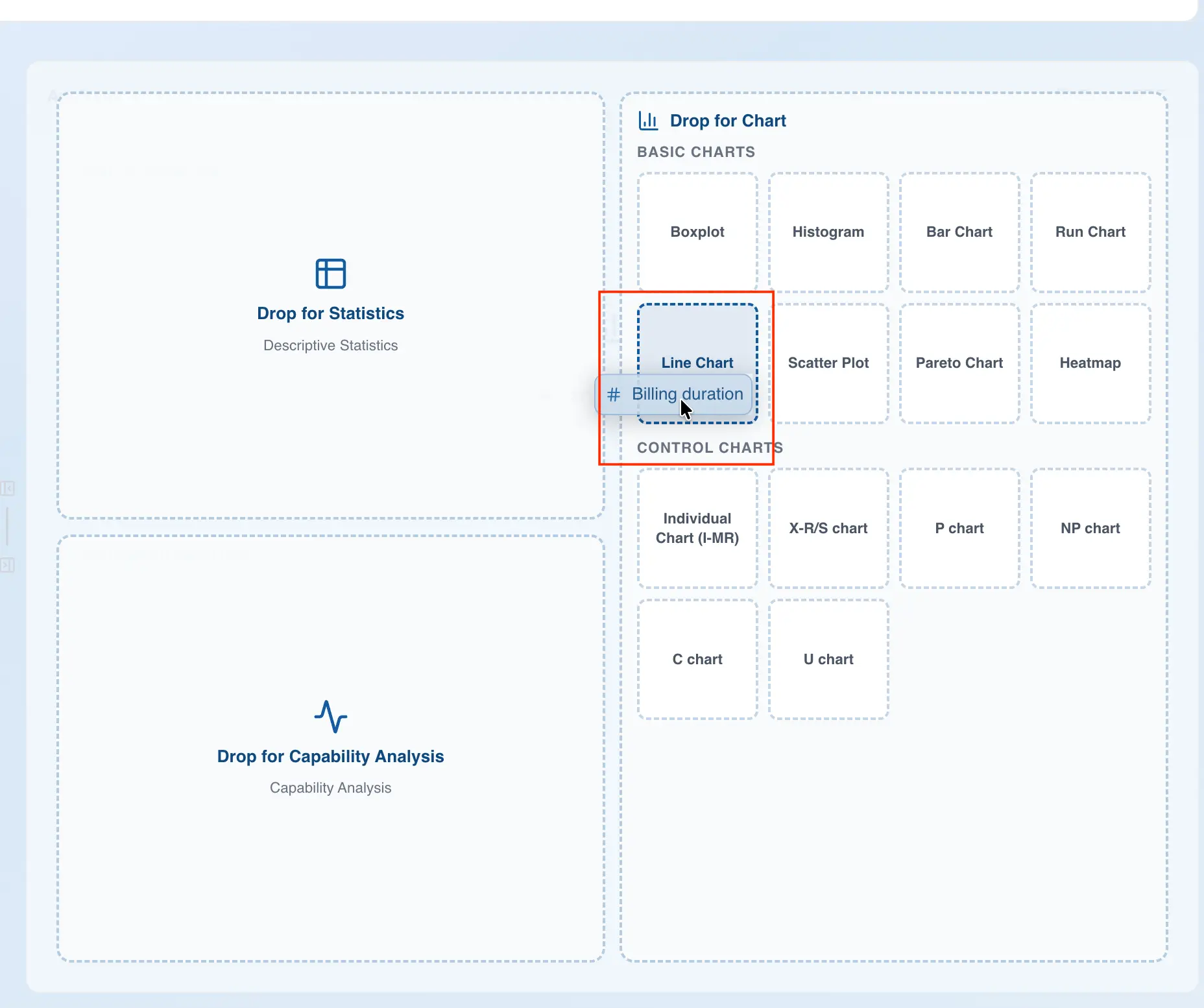
Creating a new chart using drag and drop
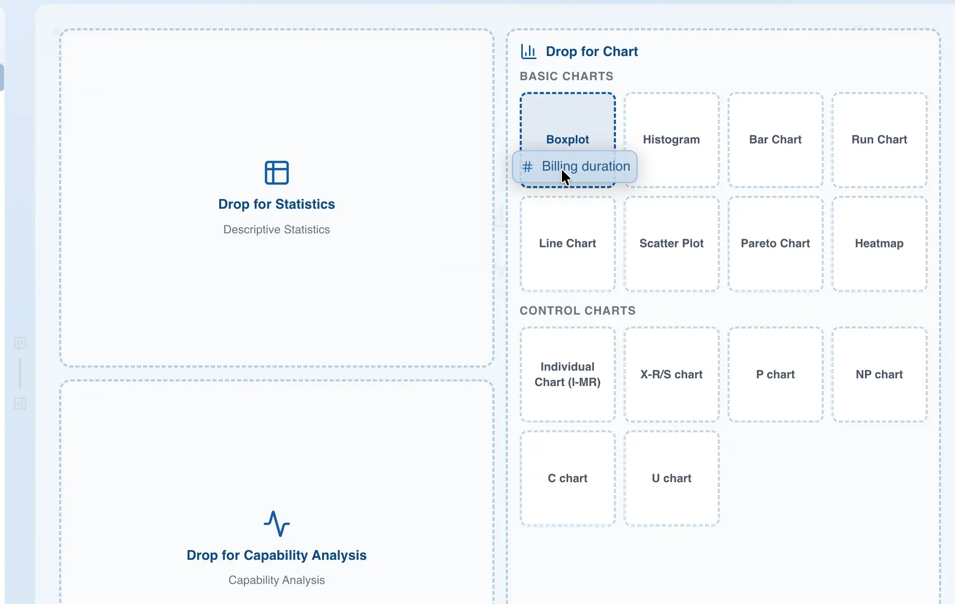
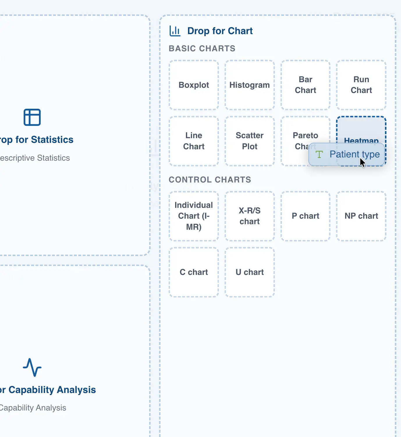
This is the easiest way to create a chart in QSuite, saving you several steps. To create a chart this way:
- Drag the column to the analysis panel
- Drop the column on the chart type you want to create
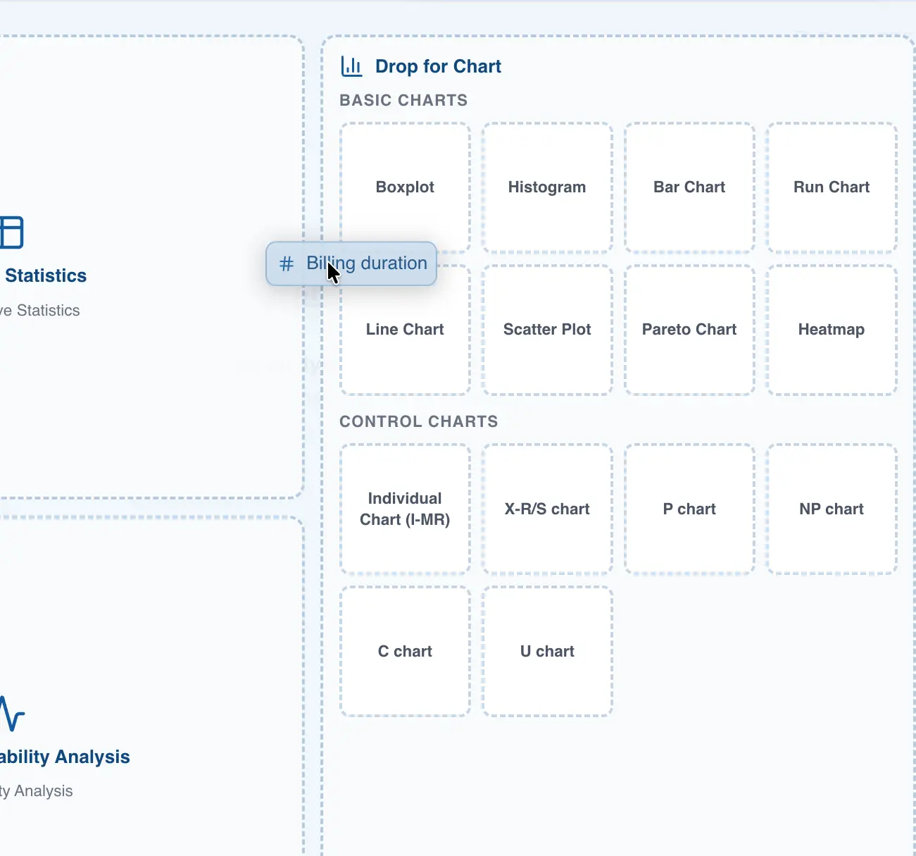
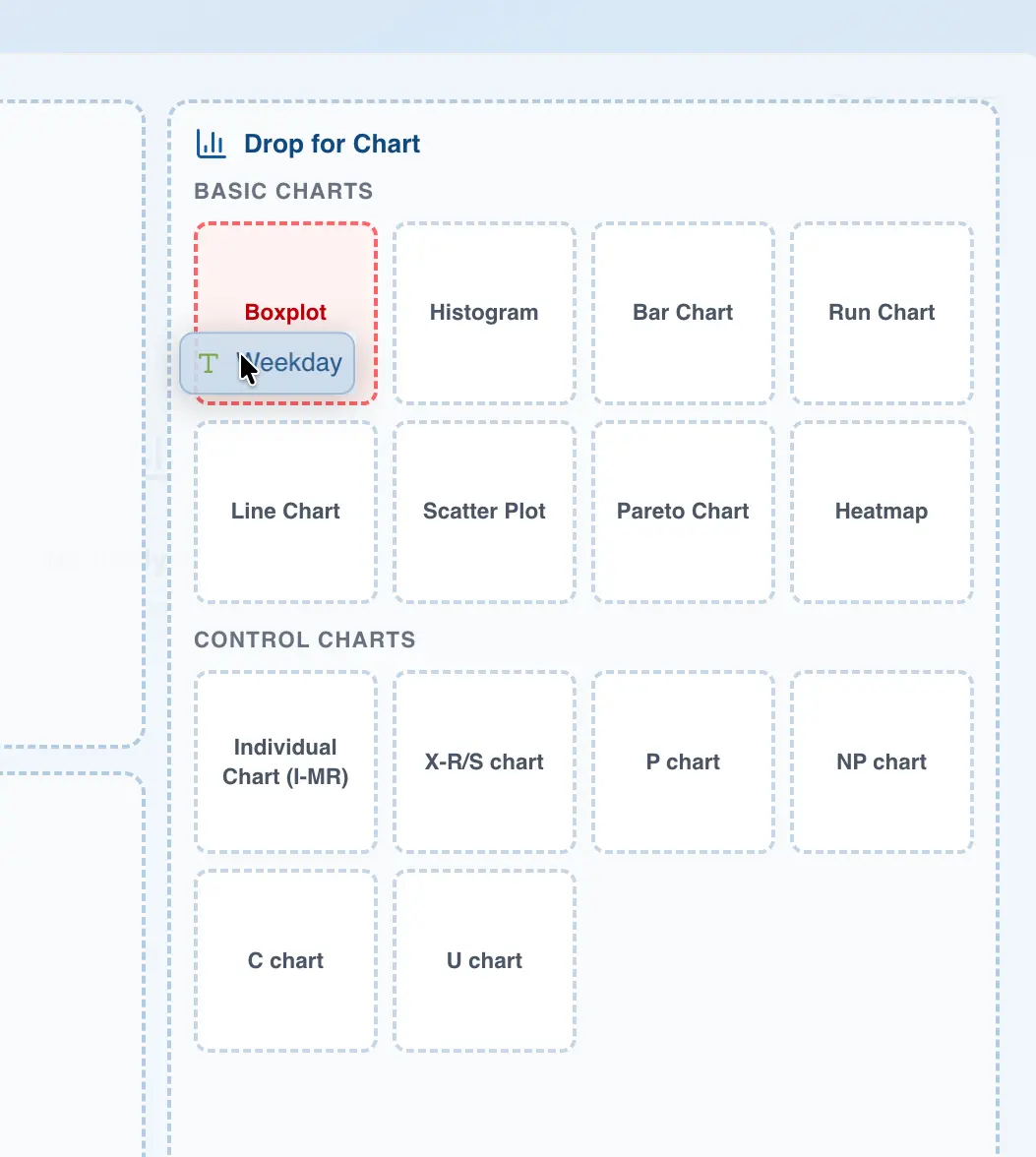
Note that some charts can only be created using integer or decimal data columns, such as the histogram. If you try to drag a categorical column onto a chart that requires integer or decimal data, QSuite will display a red area to indicate that the action is not allowed.
The following table shows the supported data types for each chart type.
| Chart | Categorical | Numeric (decimal and integer) | Date | Time |
|---|---|---|---|---|
| Box plot | X | |||
| Histogram | X | |||
| Bar chart | X | X | ||
| Scatter plot | X | |||
| Pareto chart | X | X | X | X |
| Run chart | X | |||
| Line or trend chart | X | X | ||
| Heat map | X | X | X | X |
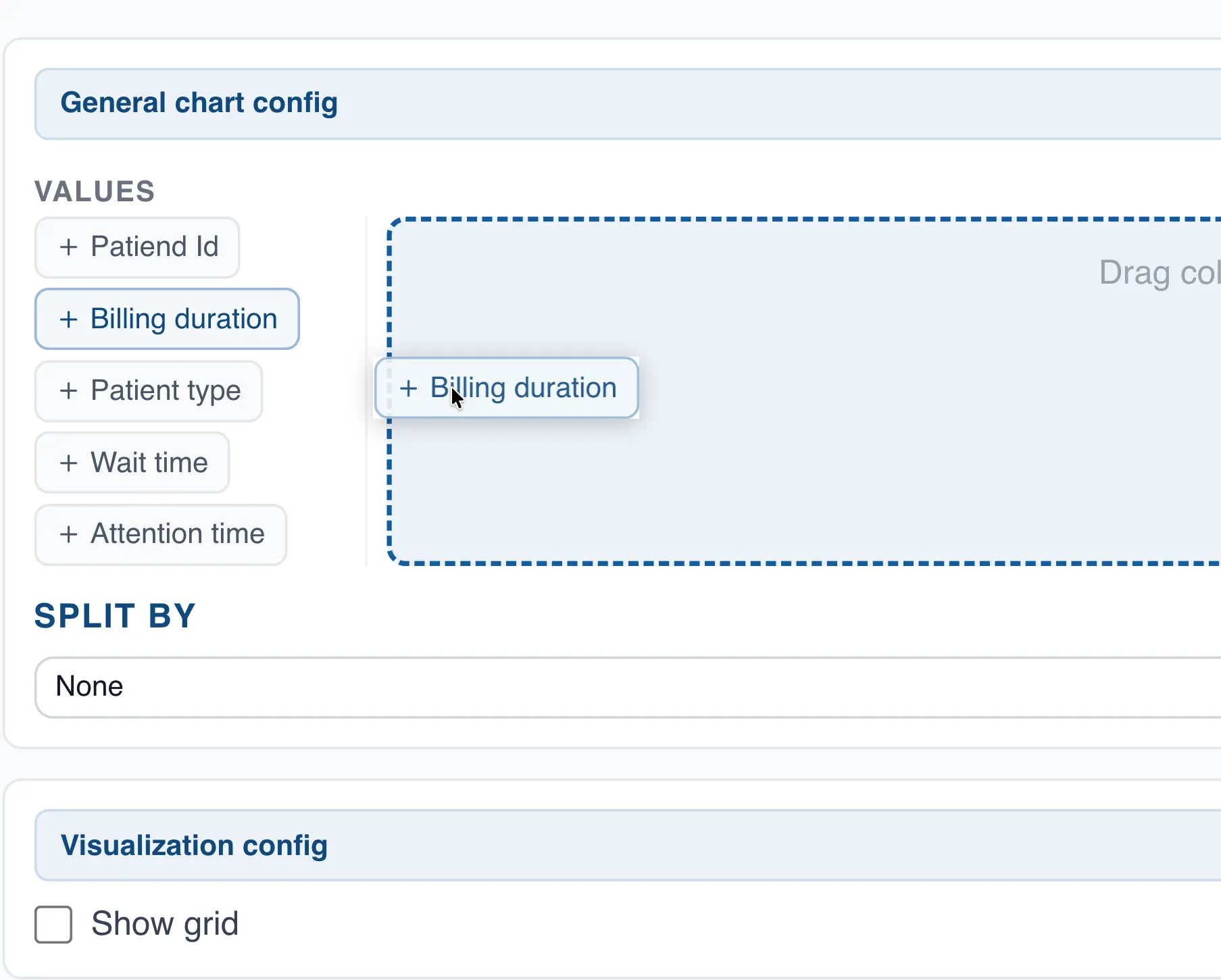
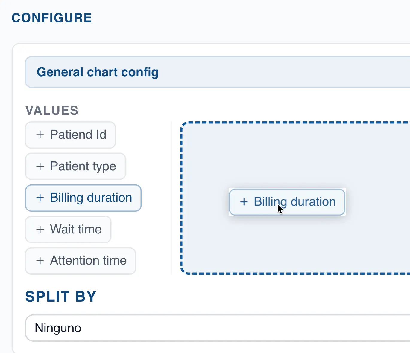
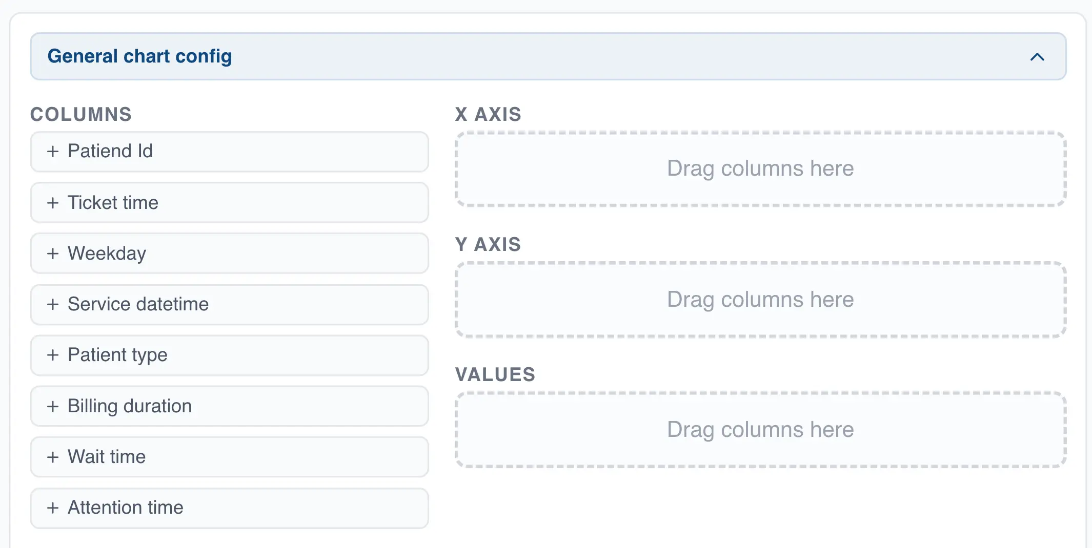
Analysis configuration
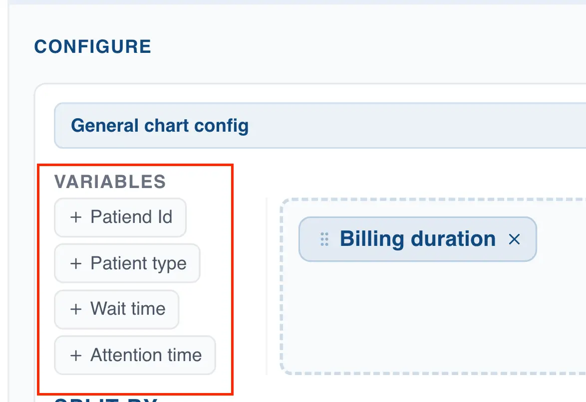
In the chart configuration panel you can select the column(s) you want to display in the chart. All charts require at least one column to be selected.
If you built the chart by dragging and dropping a column, QSuite automatically uses the values from that column to build the chart. Otherwise, you will need to specify the column you want to visualize in the "Values" section.
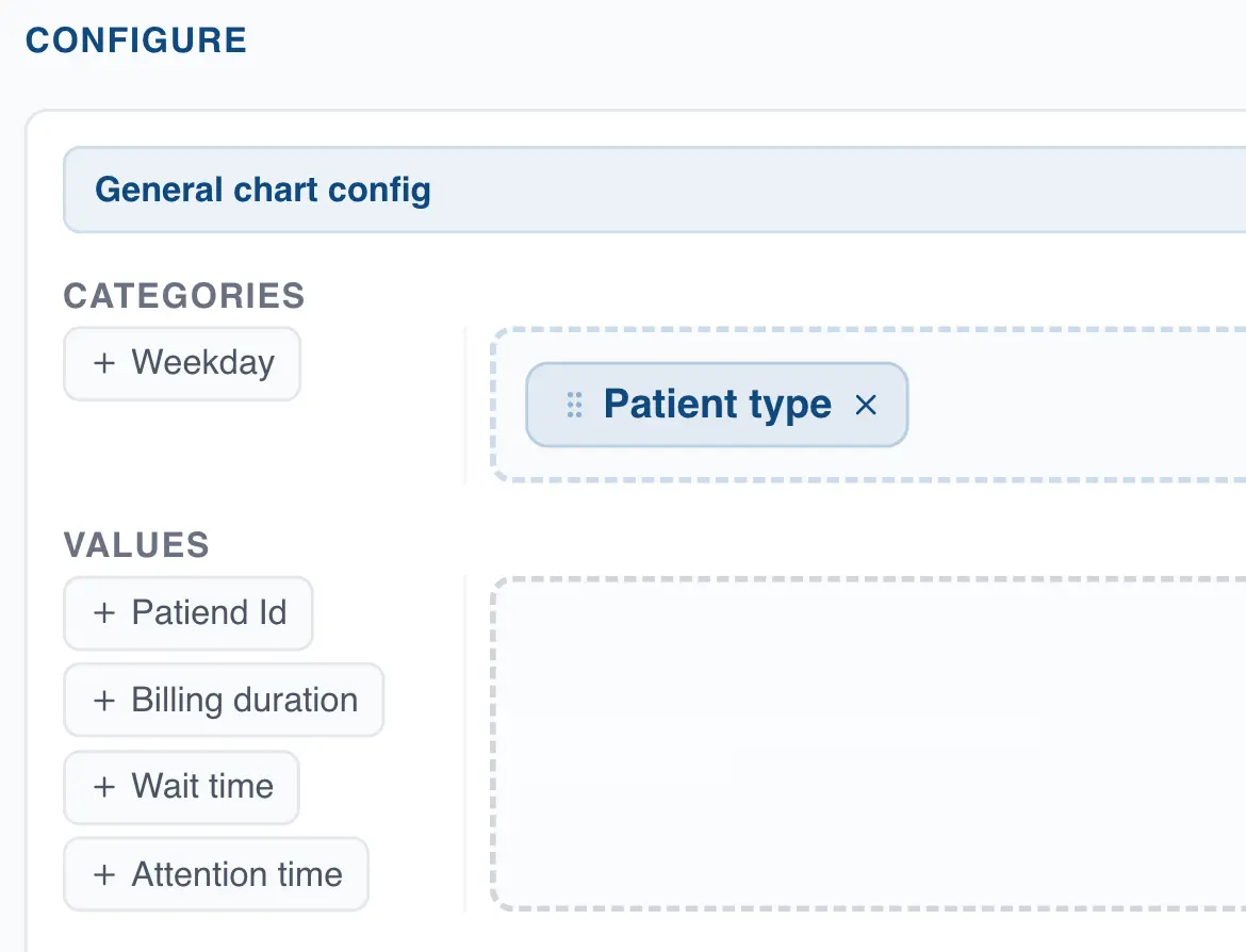
Some charts also offer the option to choose categorical columns for the X Axis, allowing you to summarize your data based on the values in that column. To configure the X Axis for these charts, simply drag the column to the corresponding drop zone, as shown below.
Analysis segmentation
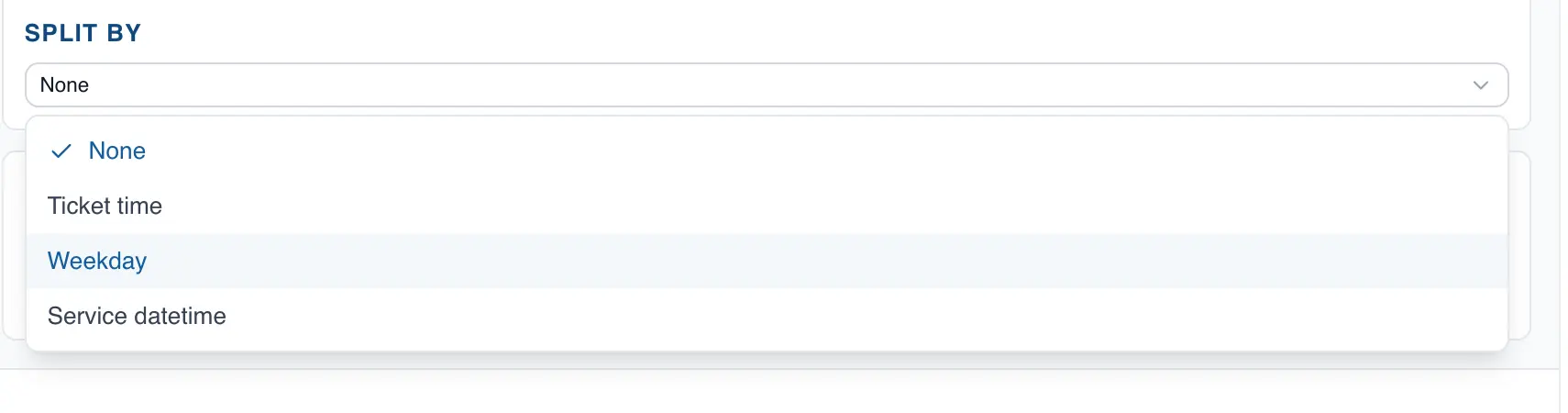
All charts include the option to segment the analysis using a categorical column. This lets you view the behavior of your data by category. To do so, click the dropdown in the "Split by" section and choose the variable you want to use for segmentation.
After selecting the segmentation column, some charts will display a new option that lets you choose whether to show all categories in the same chart or in separate charts.
Box Plot
The box plot is a useful chart for analyzing the distribution of your data and comparing across different categories. In QSuite you can create a box plot in seconds from the menu bar or by dragging the column you want to analyze to the analysis panel.
Creating the chart from the menu bar
- Click on "Create Analysis"
- Go to the "Create Chart" option
- Select the box plot from the dropdown list
- In the "Values" section, drag the column you want to analyze to create the chart.
Creating the chart using drag and drop
- Drag the column you want to analyze to the analysis panel
- Drop the column on the area labeled "Box Plot"
QSuite will create the chart automatically.
Displaying more than one box plot in the same chart
The box plot is particularly useful for comparing across categories. To do so, follow these steps:
- If it is not already open, open the chart configuration panel by clicking the gear icon
 located at the far right of the analysis header
 - Go to the "Split by" section and choose the column you want to use to segment the chart.
QSuite will create one box plot for each category in the selected segmentation column.
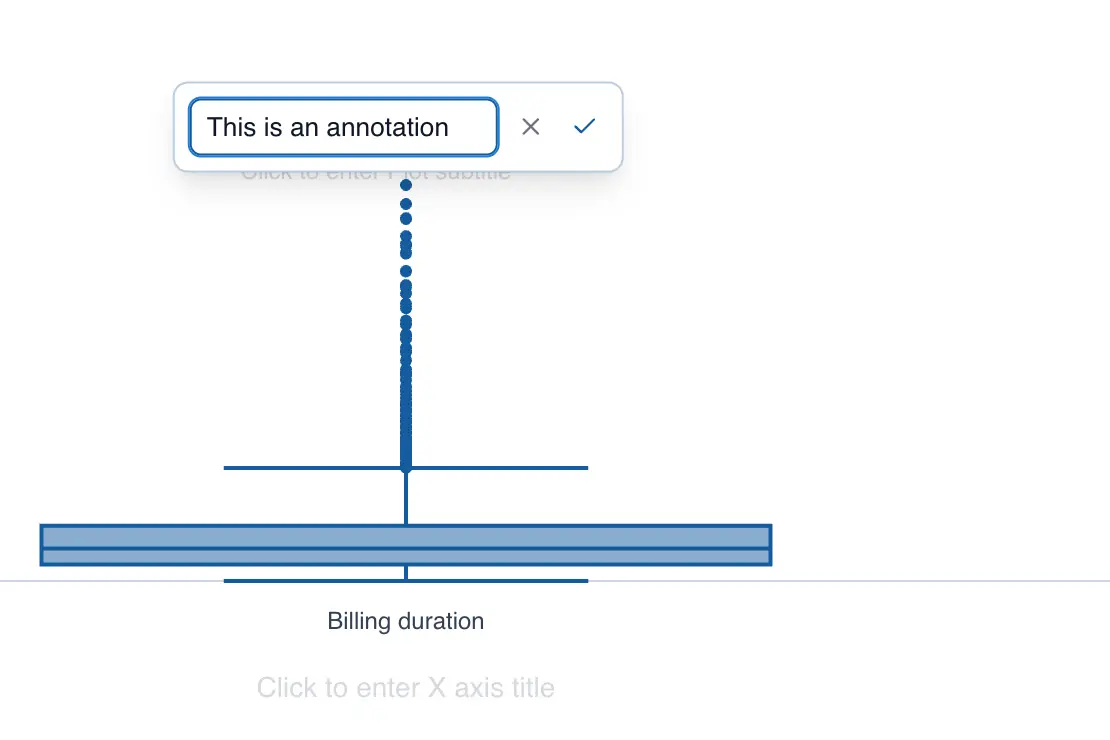
Annotating an outlier in the box plot
You can add annotations to outliers in the chart by following these steps:
- Click on the point you want to annotate
- When the context menu appears, click "Annotate point"
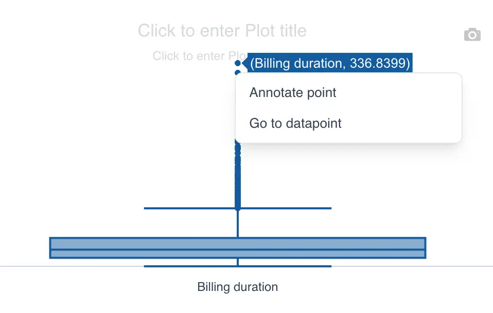
- Add your text in the input box
- Click the checkmark to save the annotation
Histogram
The histogram lets you visualize the distribution of your data. In QSuite you can build one quickly.
Creating the chart from the menu bar
- Click on "Create Analysis"
- Go to the "Create Chart" option
- Select the histogram from the dropdown list
- In the "Values" section, drag the column you want to analyze to create the chart.
Creating the chart using drag and drop
- Drag the column you want to analyze to the analysis panel
- Drop the column on the area labeled "Histogram"
QSuite will create the chart automatically.
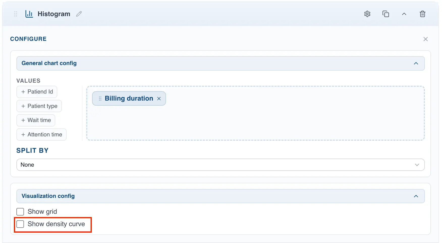
Showing the density curve
To display a curve fitted to the shape of the histogram, follow these steps:
- If it is not already open, open the chart configuration panel by clicking the gear icon located at the far right of the analysis header
- In the histogram configuration panel, go to the "Display Settings" section
- Check the box labeled "Show density curve"
Bar Chart
The bar chart presents categorical data with rectangular bars whose lengths are proportional to the values they represent.
Creating the bar chart from the menu
- Click on "Create Analysis"
- Go to the "Create Chart" option
- Select the bar chart from the dropdown list
- In the "Values" section, drag the column you want to chart.
- If the selected column is categorical (text), QSuite will create the bar chart automatically. Each unique value in the selected column will appear as a category in the bar chart.
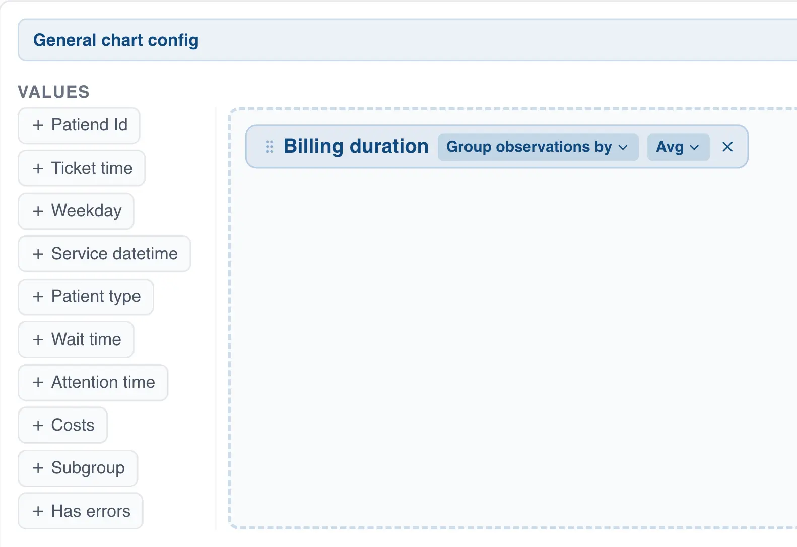
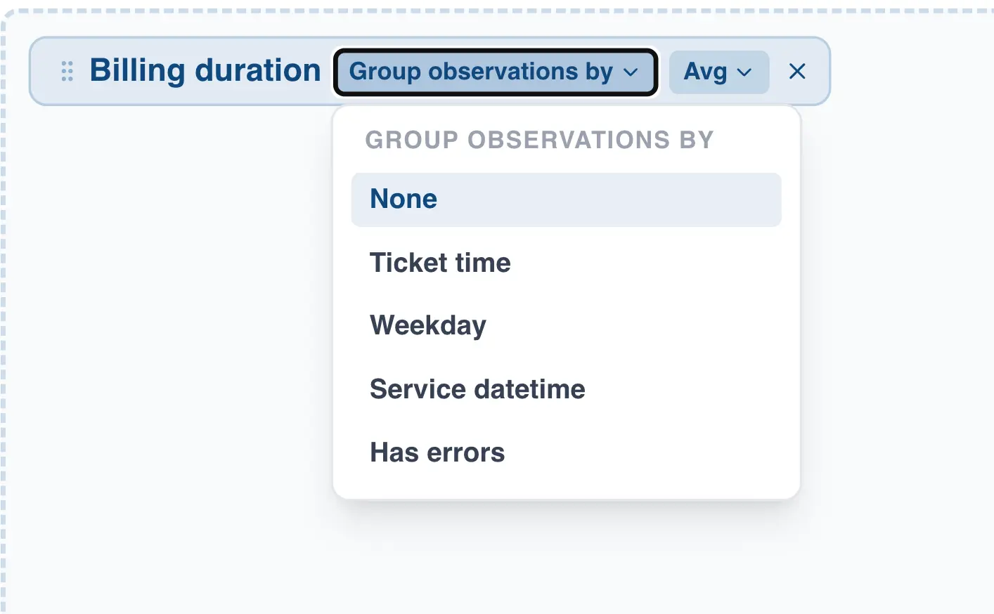
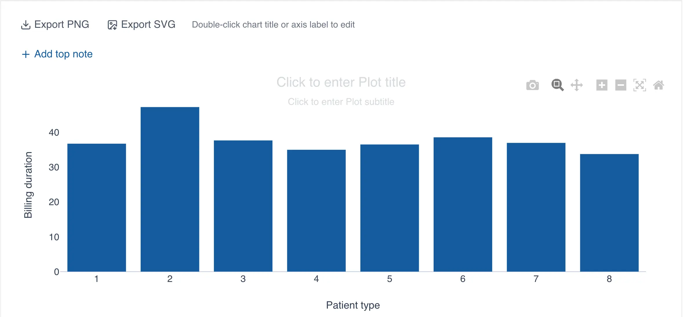
- If the column is numeric, click "group observations by" on the column label to specify a grouping variable.
The grouping variable creates the different categories in the bar chart based on the values it contains. For example, the following chart shows the average billing time (numeric column) grouped by patient type (grouping variable):
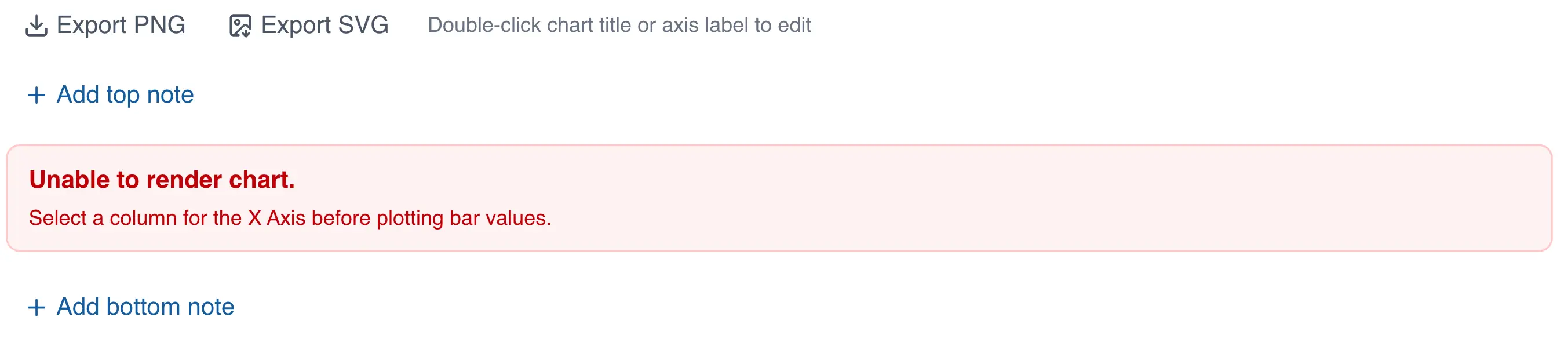
When data is numeric and no grouping variable is selected, an error will appear in place of the chart.
Creating the bar chart using drag and drop
- Drag the column to the analysis panel
- Drop the column on the area labeled "Bar Chart"
- If you selected a numeric column, follow steps 4, 5, and 6 from the previous section to select the grouping variable.
Selecting the summary statistic for the bar chart
When the column is categorical, QSuite uses the observation count as the default summary statistic. The following summary statistics are available for categorical data:
- Count: counts the number of observations in each group.
- % of total: calculates the percentage of each group based on the total observations in the selected column.
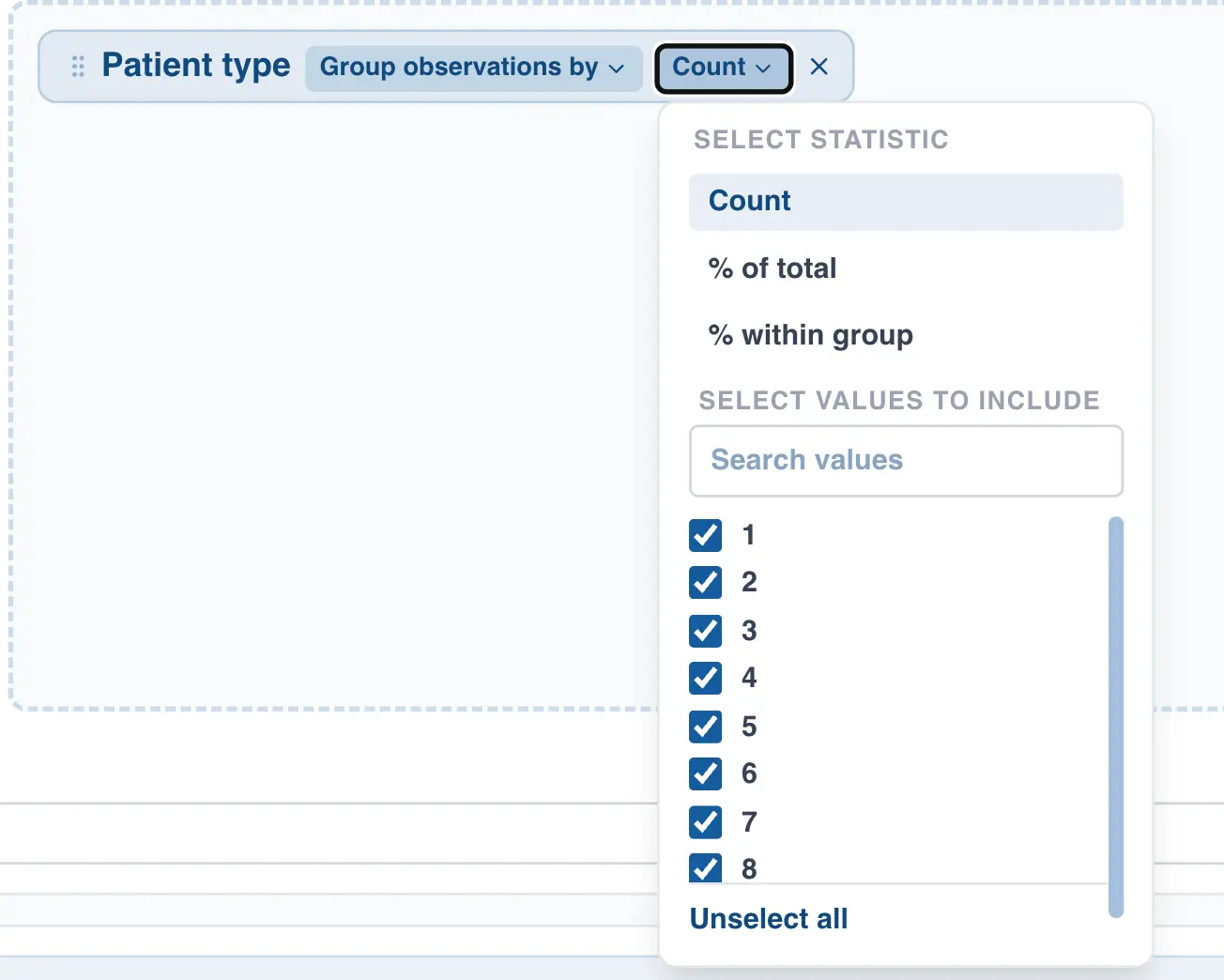
When the selected column is numeric, additional summary statistics are available, such as mean, median, standard deviation, and others.
Grouping dates in the bar chart
When a date column is used on the horizontal axis, QSuite lets you specify how you want to group your data.
The available options are:
- By year
- By quarter
- By month
- By week number
- By day of the week (Monday, Tuesday, etc.)
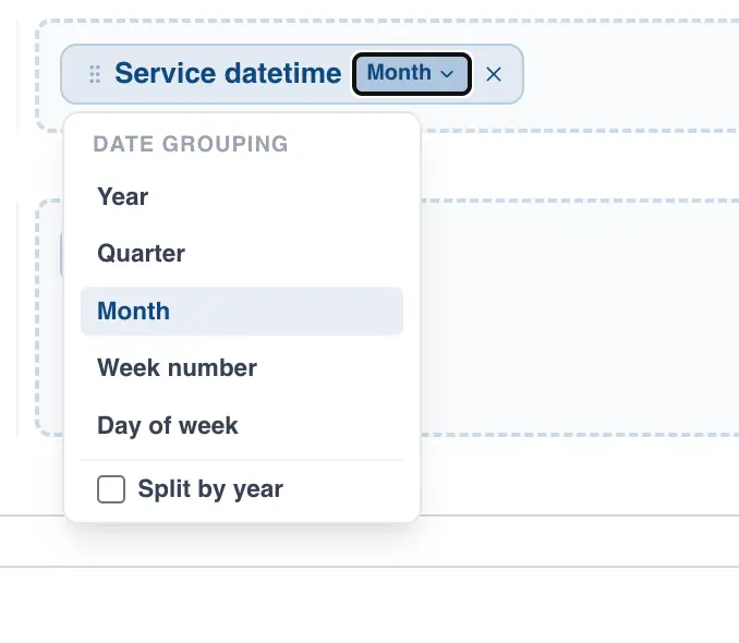
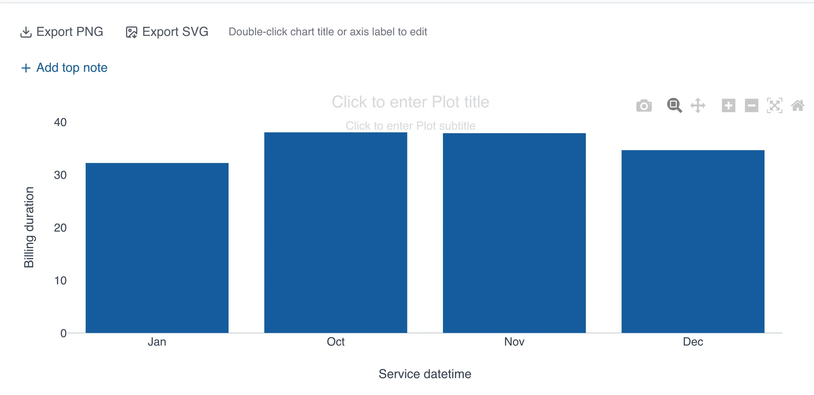
If you select monthly grouping, QSuite automatically configures the chart to display your data month by month, as shown in the image below.
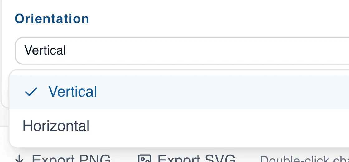
Changing the bar chart orientation
The bar chart defaults to vertical orientation, but you can switch to horizontal at any time by following these steps:
- If it is not already open, open the chart configuration panel by clicking the gear icon
- In the "Orientation" section, click the dropdown to make the change
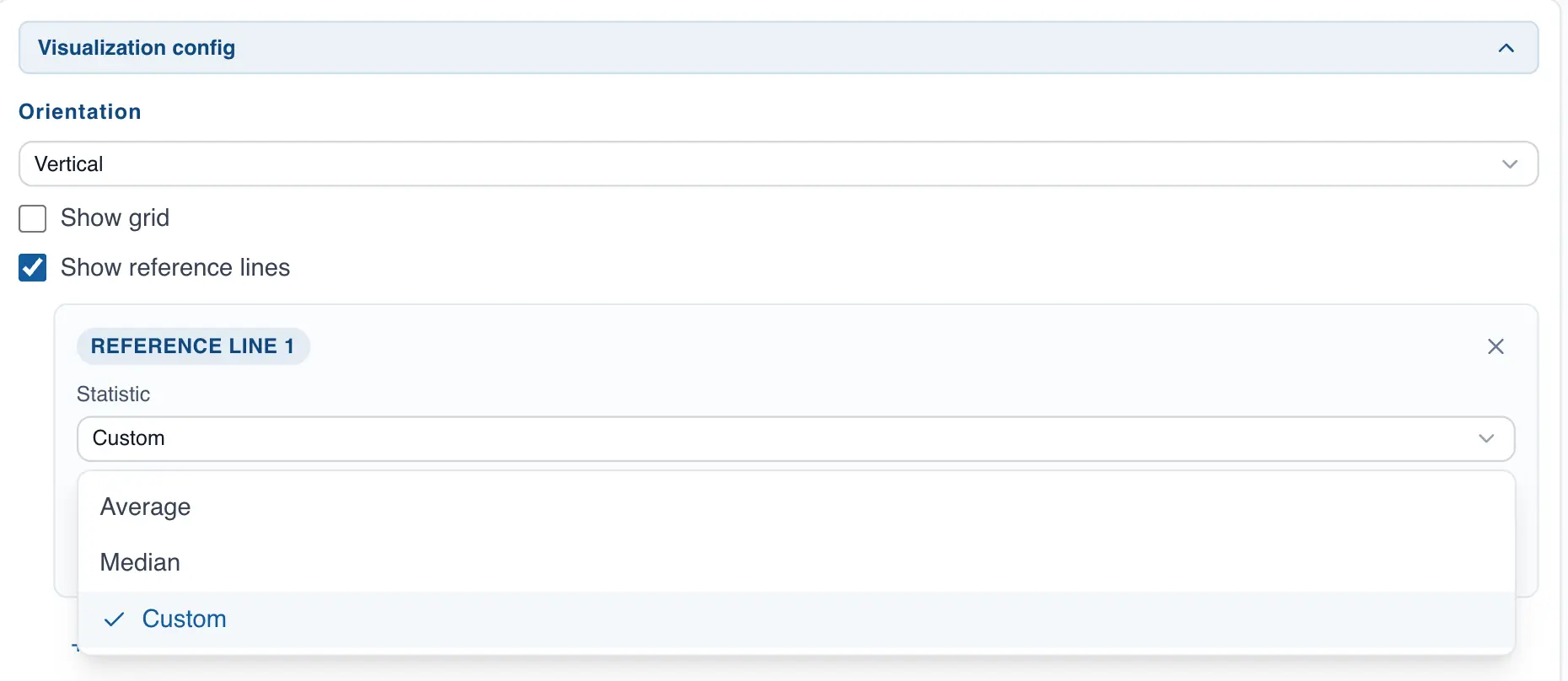
Adding reference lines to the bar chart
You can add reference lines to the chart as follows:
- If it is not already open, open the chart configuration panel by clicking the gear icon
- In the "Display Settings" section, enable the "Show reference lines" option
- Add the reference lines you want
Scatter Plot
The scatter plot lets you visualize the relationship between two variables. This section covers how to build one in QSuite.
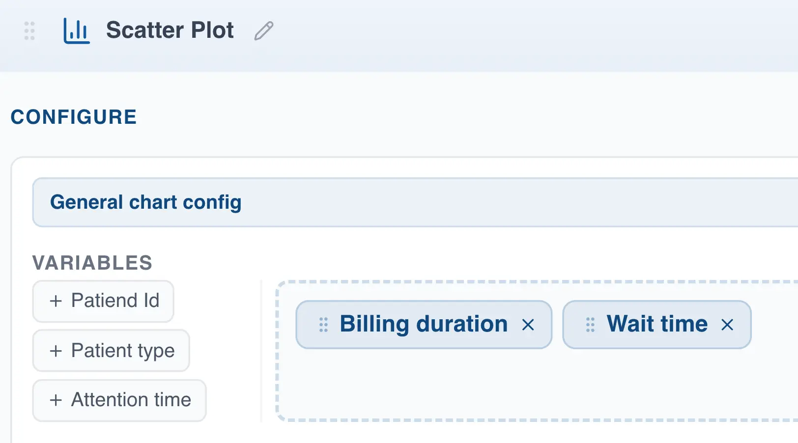
Creating the scatter plot from the menu
- Click on "Create Analysis"
- Go to the "Create Chart" option
- Select the scatter plot from the dropdown list
- In the "Variables" section, drag at least two columns you want to analyze.
Creating the scatter plot using drag and drop
- Drag the column to the analysis panel
- Drop the column on the area labeled "Scatter Plot"
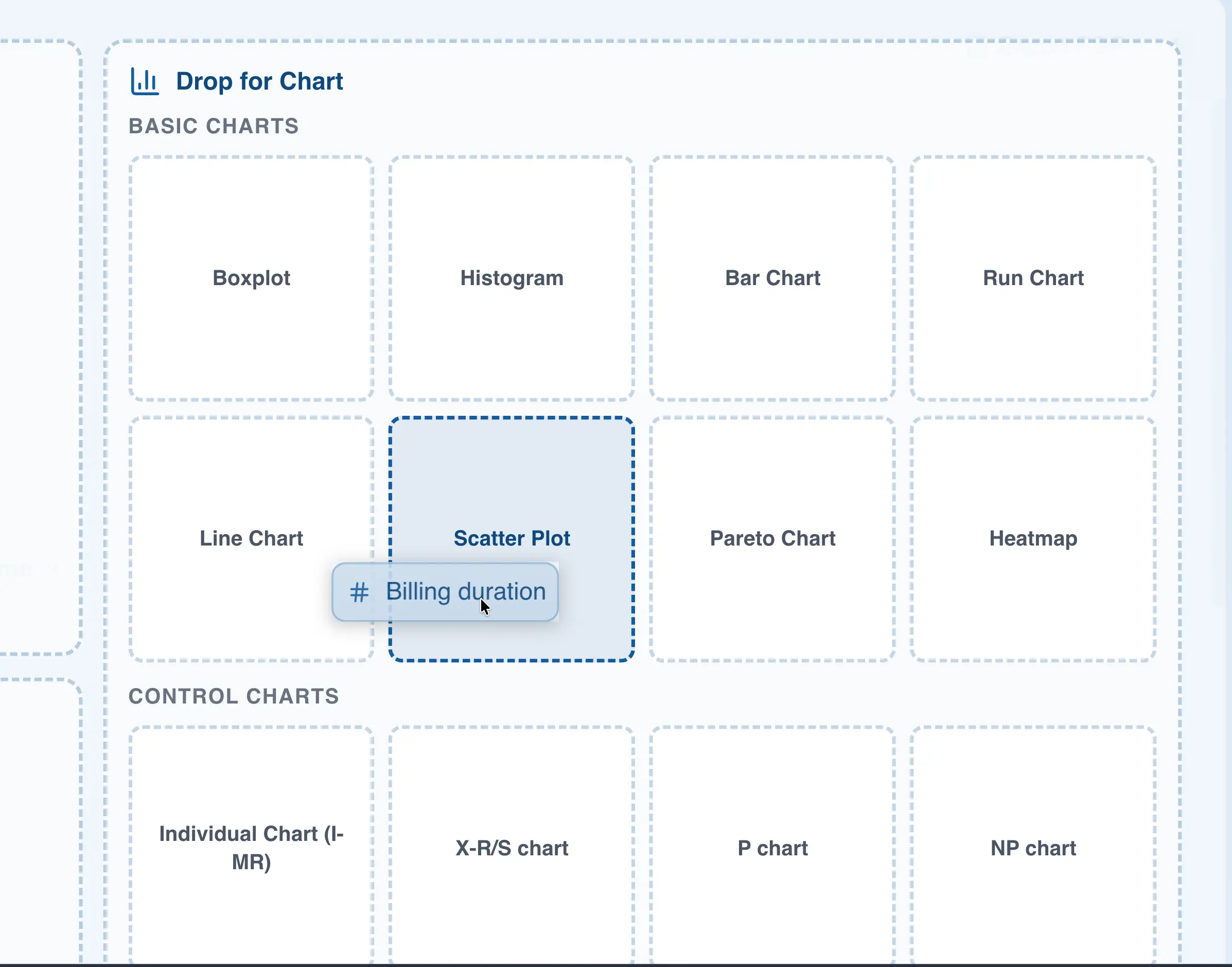
- Add another column in the "Variables" section to create the chart. If you leave only one column selected, the chart will not render.
Creating a scatter plot with three or more columns
When you select three or more columns in the "Variables" section, QSuite builds a scatter plot for each combination of variables.
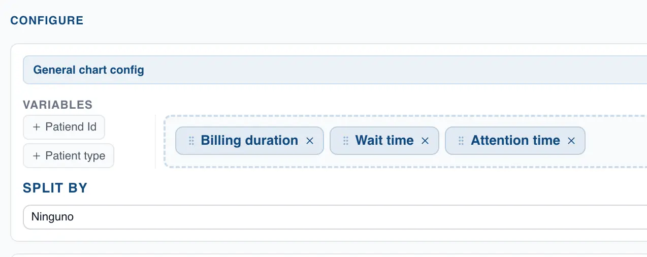
For example, with the configuration shown in the image above, QSuite will display three charts:
- A first chart with the columns "Billing duration" and "Wait time"
- A second chart with the columns "Billing duration" and "Attention time"
- A third chart with the columns "Wait time" and "Attention time"
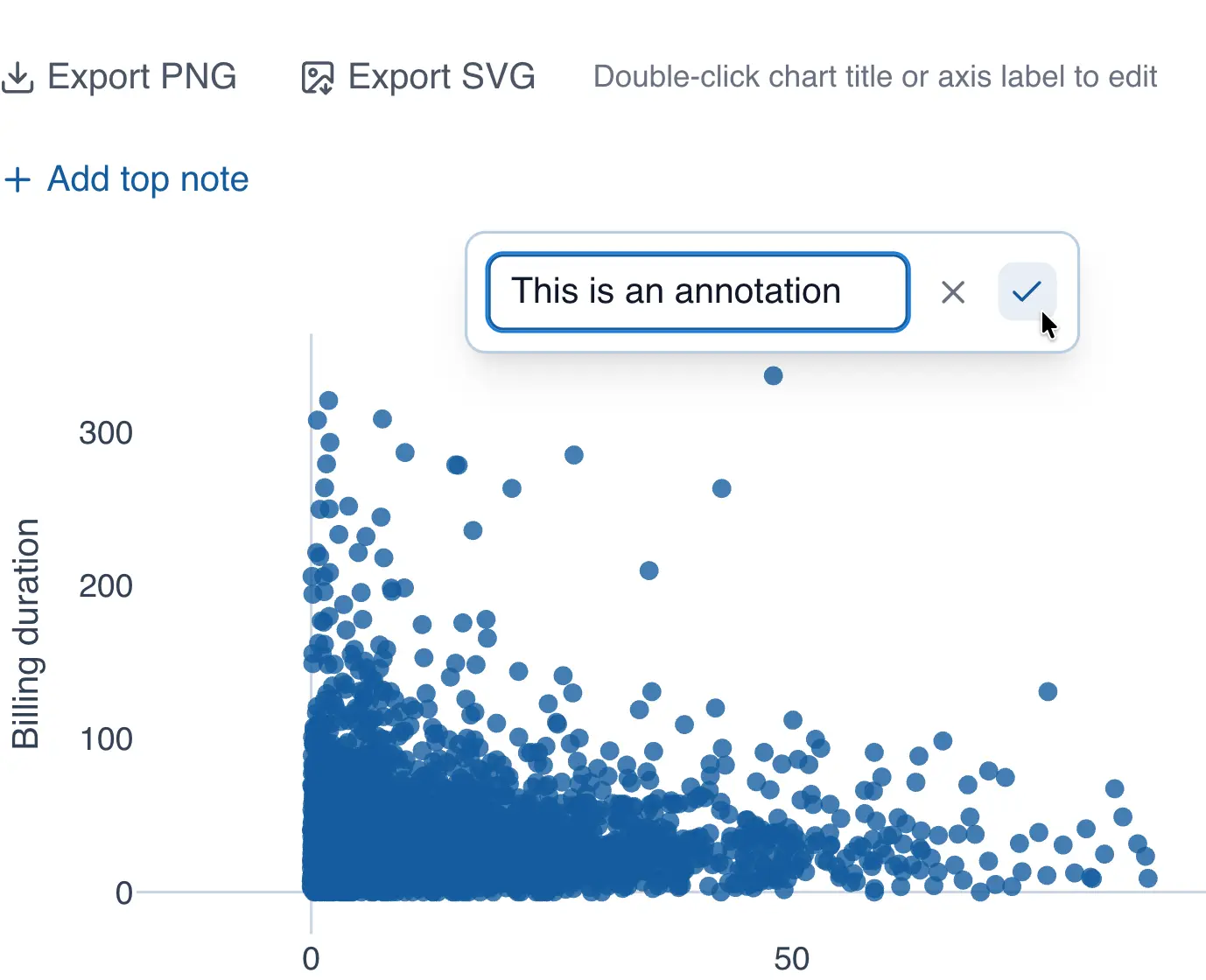
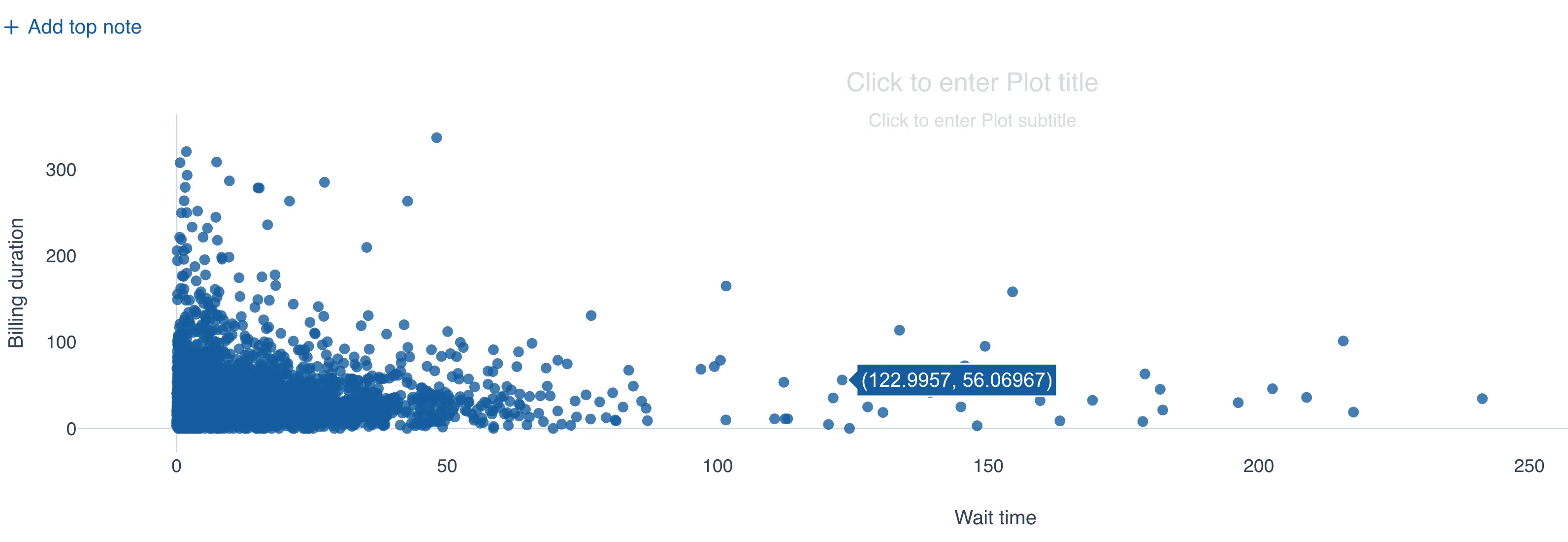
Annotating a point in the scatter plot
You can add annotations to points in the chart by following these steps:
- Click on the point you want to annotate
- When the context menu appears, click "Annotate point"
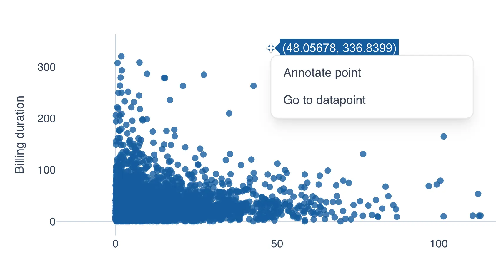
- Add your text in the input box
- Click the checkmark to save the annotation
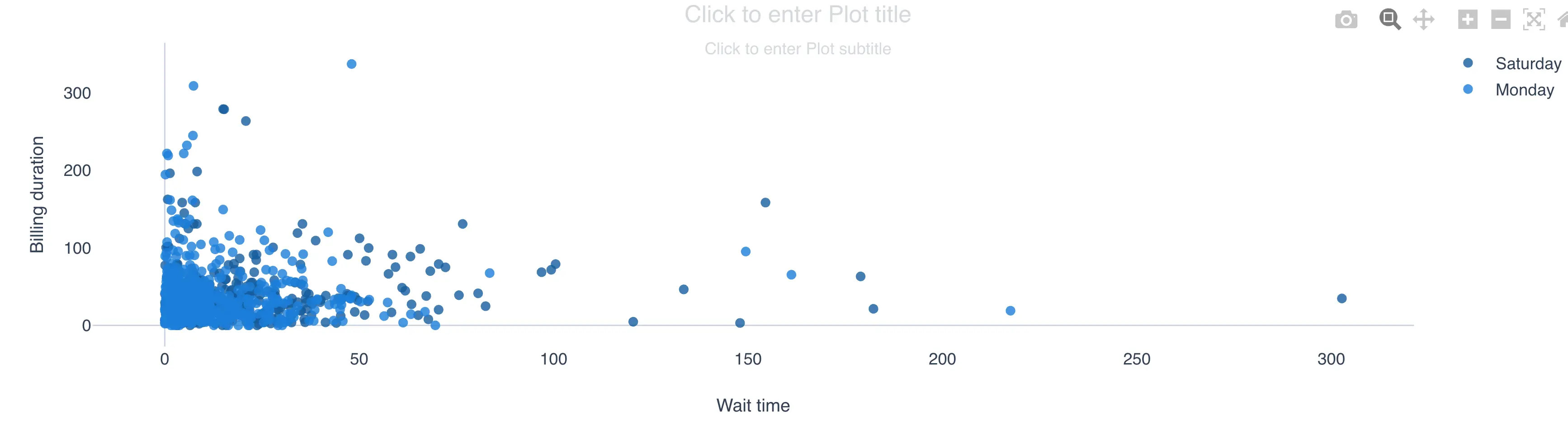
Adding a segmentation variable in the scatter plot
QSuite lets you add a segmentation variable to stratify your analysis. To do so, follow these steps:
- If it is not already open, open the configuration panel by clicking the gear icon
- In the "Split by" section, click the dropdown to display the available columns
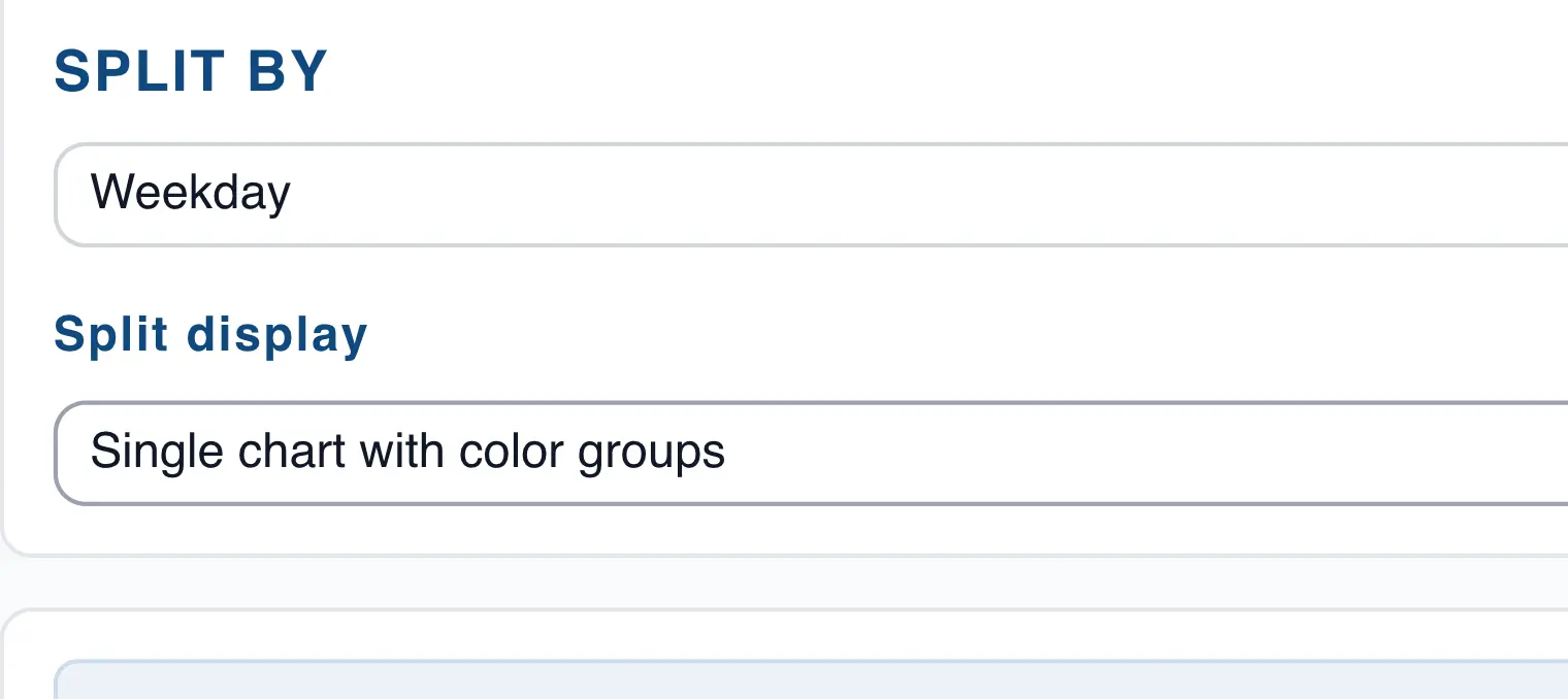
- Select the column you want to use for segmentation
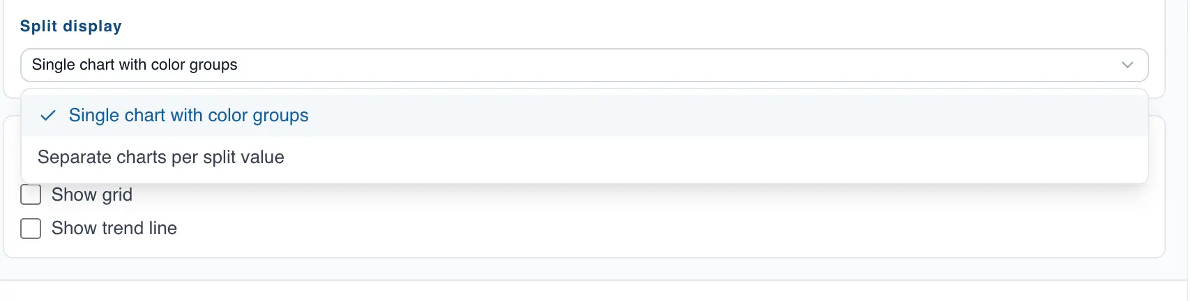
- In "Split display", choose whether to show the segmentation in the same chart or in separate charts. The image below shows how it looks in a single chart.
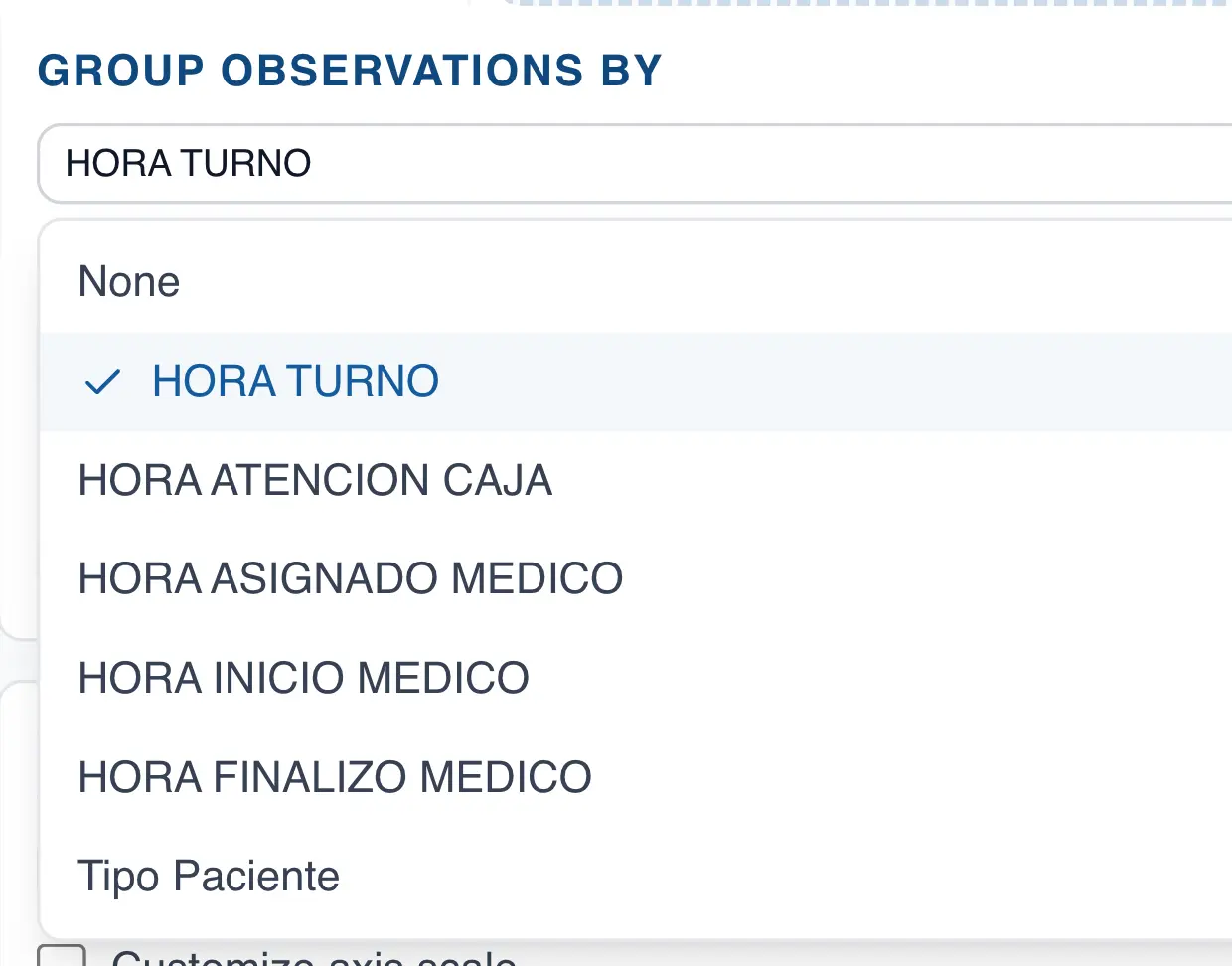
Grouping observations in the scatter plot
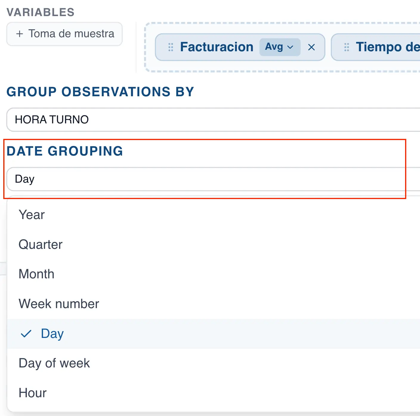
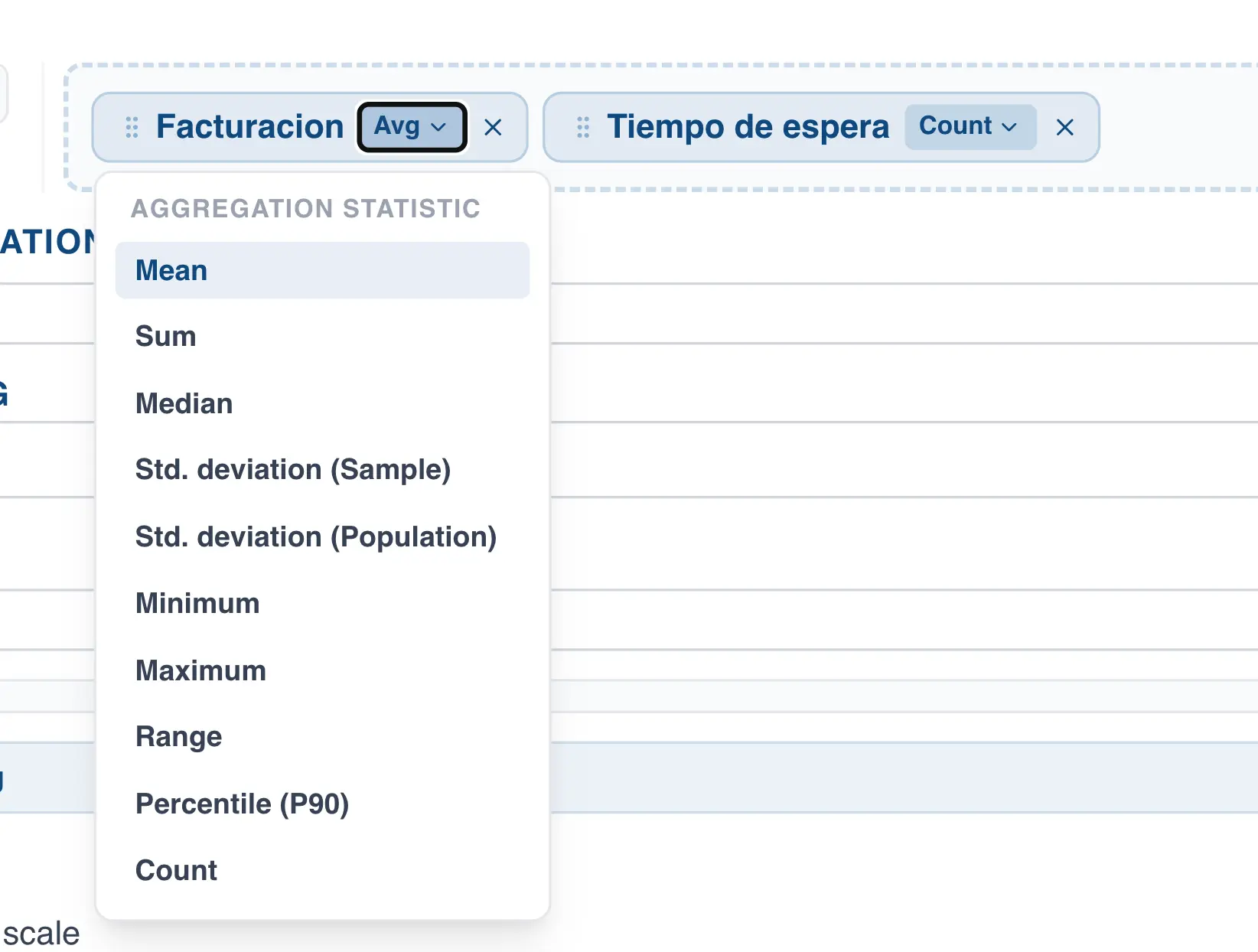
QSuite lets you group observations using a categorical or date column. Grouping observations behaves differently from segmentation. When grouping, each point in the scatter plot represents a category or date (day, month, week, etc.), and you must specify the summary statistic to use for that group of observations (mean, sum, median, etc.).
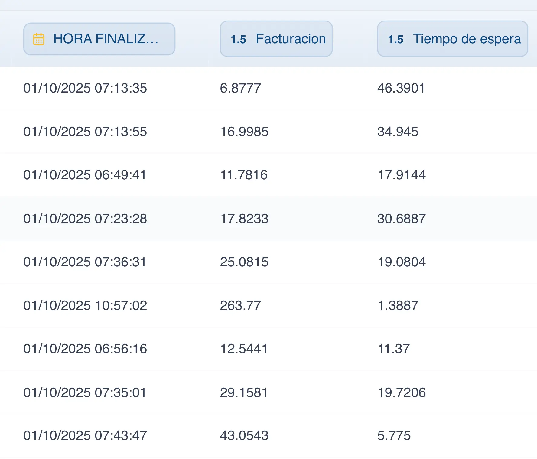
For example, each row in the dataset shown in the following image represents a patient visit. Each visit includes the date the patient checked in, billing time, total care time, and other columns.
In a traditional scatter plot, each point represents one row in the dataset. If there are 3,000 rows, the chart will have 3,000 points.
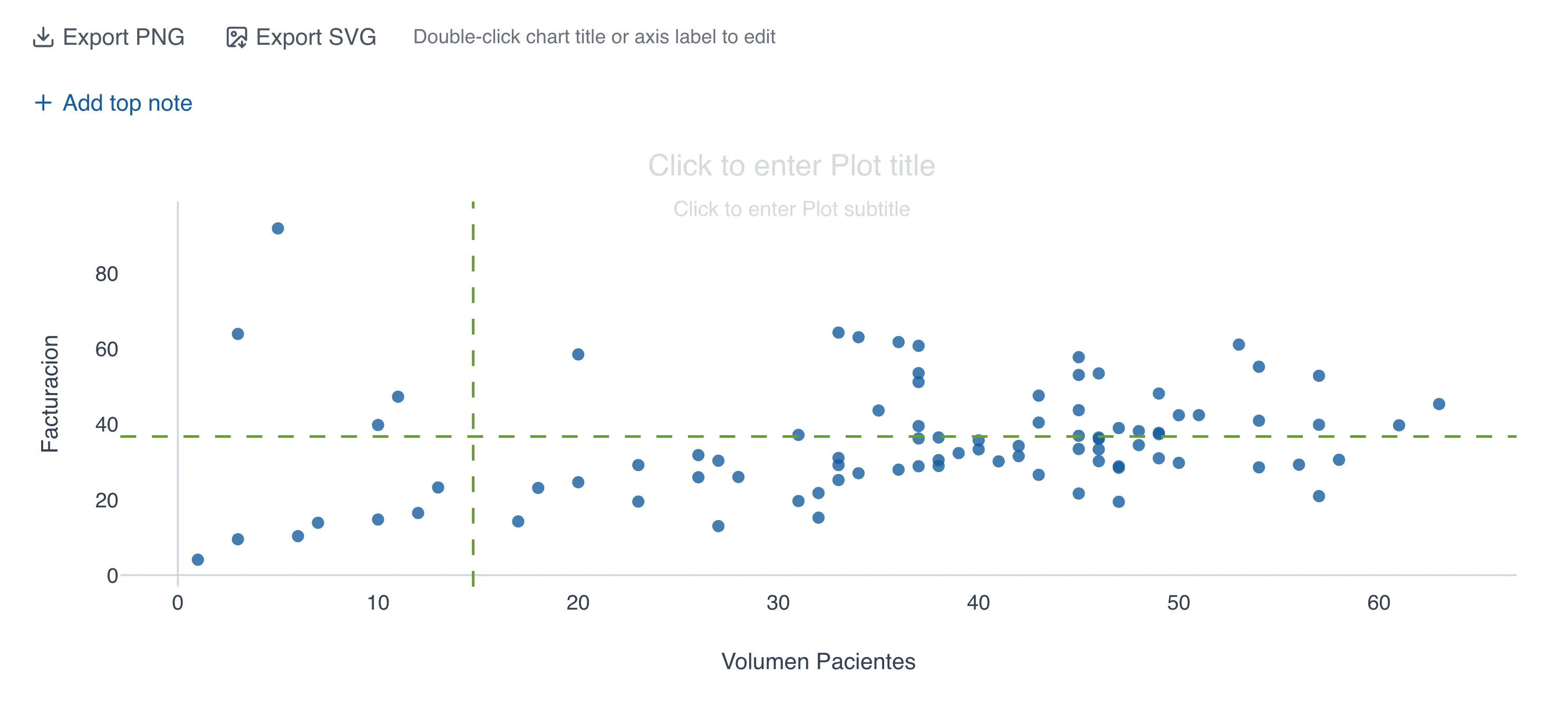
When observations are grouped, the chart has as many points as there are groups. If you group by day, each point represents one day in the dataset. If the dataset covers an entire month (30 days), the chart will have 30 data points. The following image shows a scatter plot grouped by day, where the Y axis is the average billing time and the X axis is the patient count.
To group the data in the scatter plot, follow these steps:
- Choose the variables you want to chart. At least two variables or data columns are required.
- In the "Group observations by" section, choose the column you want to use for grouping.
- If you selected a date column, choose how you want to group the date.
- Choose the summary statistic for each column. In the example above, the "Billing" column uses the mean and the "Wait time" column uses a count.
Pareto Chart
The Pareto chart separates the vital few from the trivial many, letting you prioritize across a set of categories or issues. This section covers how to build one in QSuite.
Creating the Pareto chart from the menu
- Click on "Create Analysis"
- Go to the "Create Chart" option
- Select the Pareto chart from the dropdown list
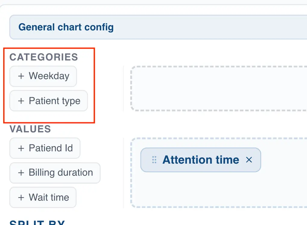
- In the "Categories" section, drag the column you want to analyze.
Creating the Pareto chart using drag and drop
- Drag the categorical column to the analysis panel
- Drop the column on the area labeled "Pareto Chart"
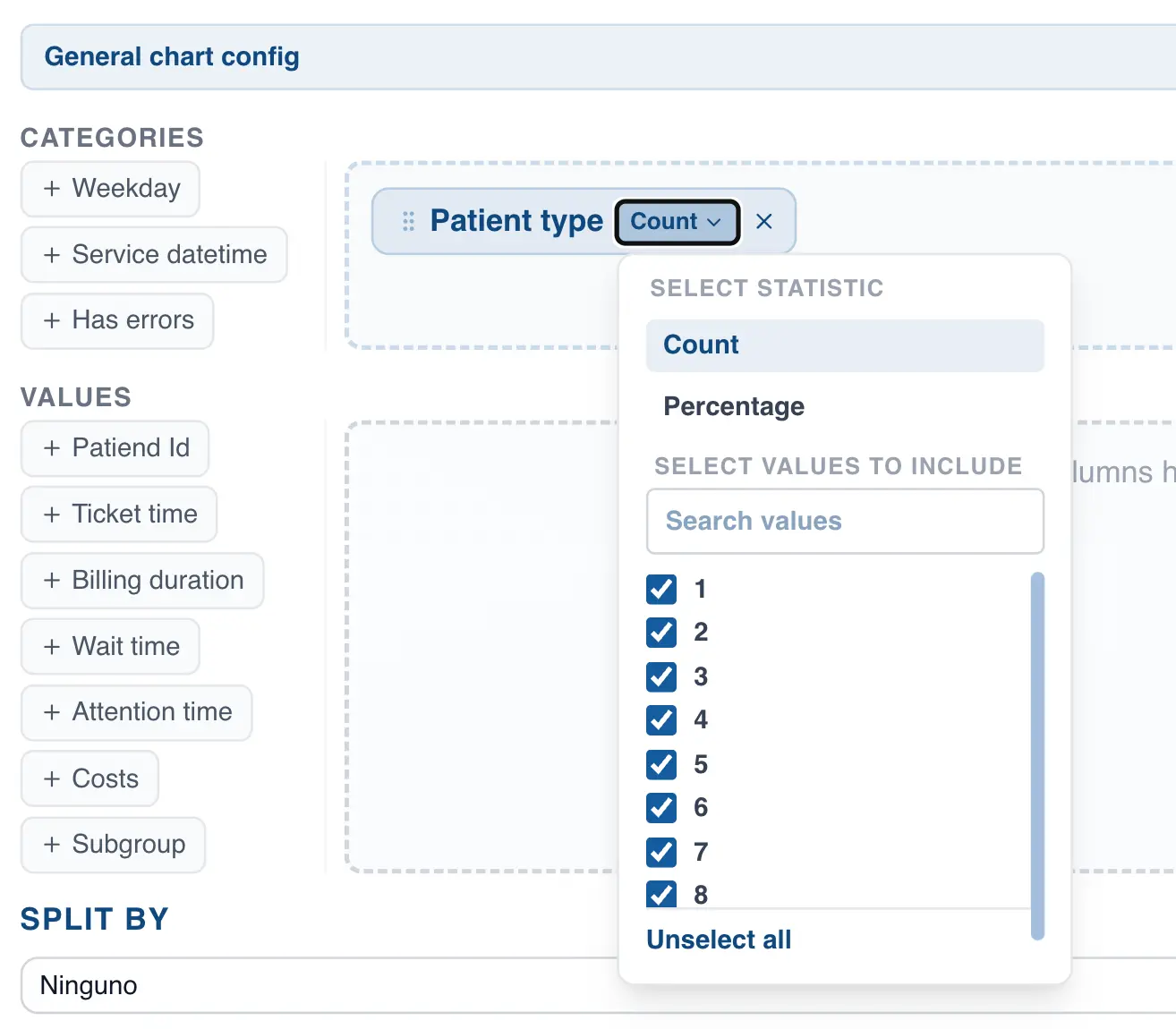
Specifying the statistic in the Pareto chart
When creating a Pareto chart, you can represent the bars as counts or percentages. By default, QSuite uses the observation count to build the chart bars. To switch to percentages, follow these steps:
- If it is not already open, open the chart configuration panel by clicking the gear icon
- Click on the selected column label where it says "Count"
- Choose between count and percentage
Using a decimal or integer column to build the Pareto chart
When you create a Pareto chart using only a categorical column, QSuite counts the total observations for each category. You can also specify a decimal or integer column to build the chart, in which case QSuite constructs the chart based on the sum of values for each category.
This is useful when you want to prioritize by sales or costs rather than by observation count. To use a decimal or integer column, follow these steps:
- If it is not already open, open the chart configuration panel by clicking the gear icon
- In the "Values" section, drag the column you want to use
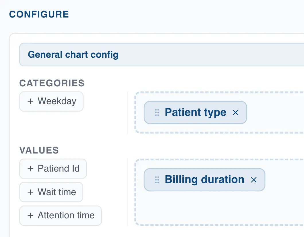
Segmenting the Pareto chart
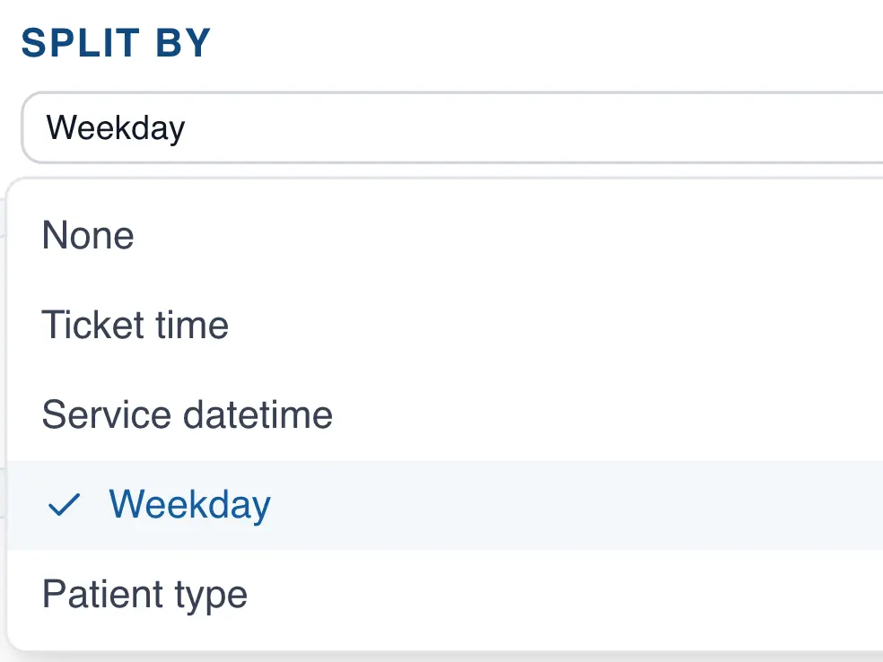
When building a Pareto chart, you can use a segmentation column. This causes QSuite to generate a separate Pareto chart for each category in that column. To segment the Pareto chart, follow these steps:
- If it is not already open, open the chart configuration panel by clicking the gear icon
- In the "Split by" section, open the dropdown to select the column you want to use for segmentation
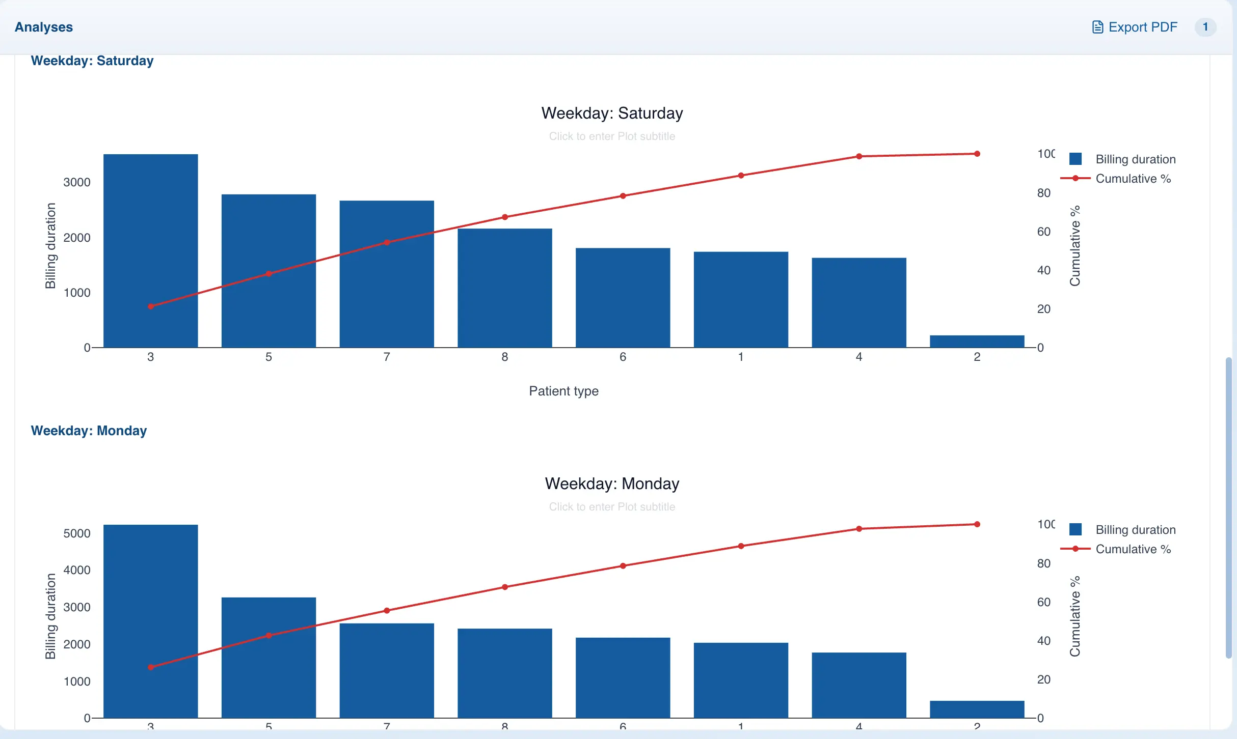
After selecting the column, QSuite will generate a Pareto chart for each category, as shown in the following image:
Run Chart
The run chart is a line diagram that displays data in chronological order to monitor a process and detect trends, shifts, or cycles.
Creating the run chart from the menu
- Click on "Create Analysis"
- Go to the "Create Chart" option
- Select the run chart from the dropdown list
- In the "Values" section, drag at least one column you want to analyze.
Creating the run chart using drag and drop
- Drag the column to the analysis panel
- Drop the column on the area labeled "Run Chart"
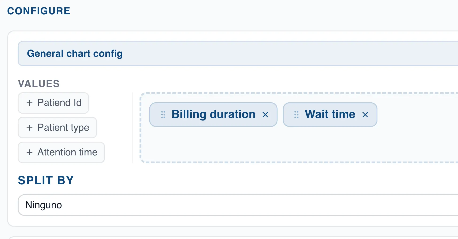
Analyzing multiple columns at once in the run chart
With QSuite you can drag multiple integer or decimal columns into the "Values" section. This generates a separate chart for each column or variable selected.
Interpreting the run chart
The run chart displays each observation in chronological order along with a center line representing the median.
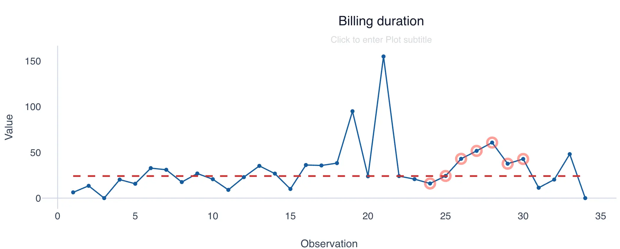
The chart is interpreted by counting the number of runs (hence its name). A run is defined as a sequence of consecutive points above or below the median, excluding those that fall directly on the median. Each time a point crosses the median, a new run begins.
The following example shows a chart with 16 runs.
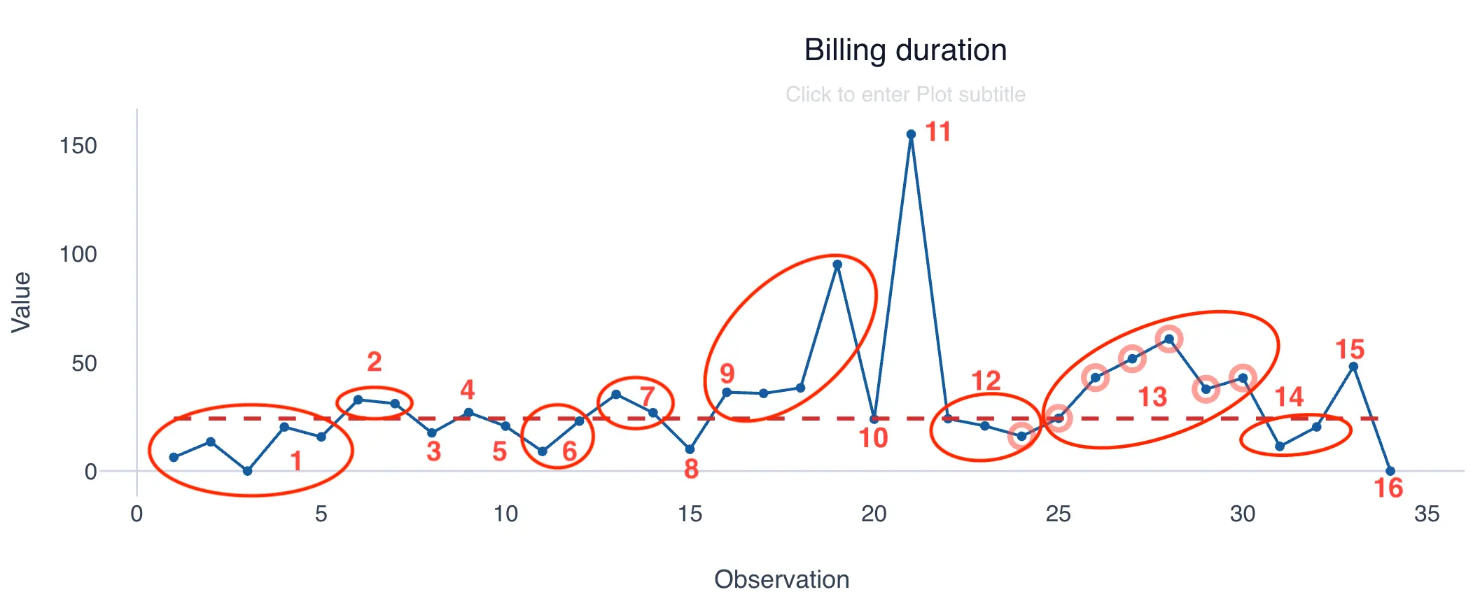
The expected behavior is that approximately 50% of points fall above the median and the remaining 50% fall below. When this condition is not met, some external variable may be affecting the process.
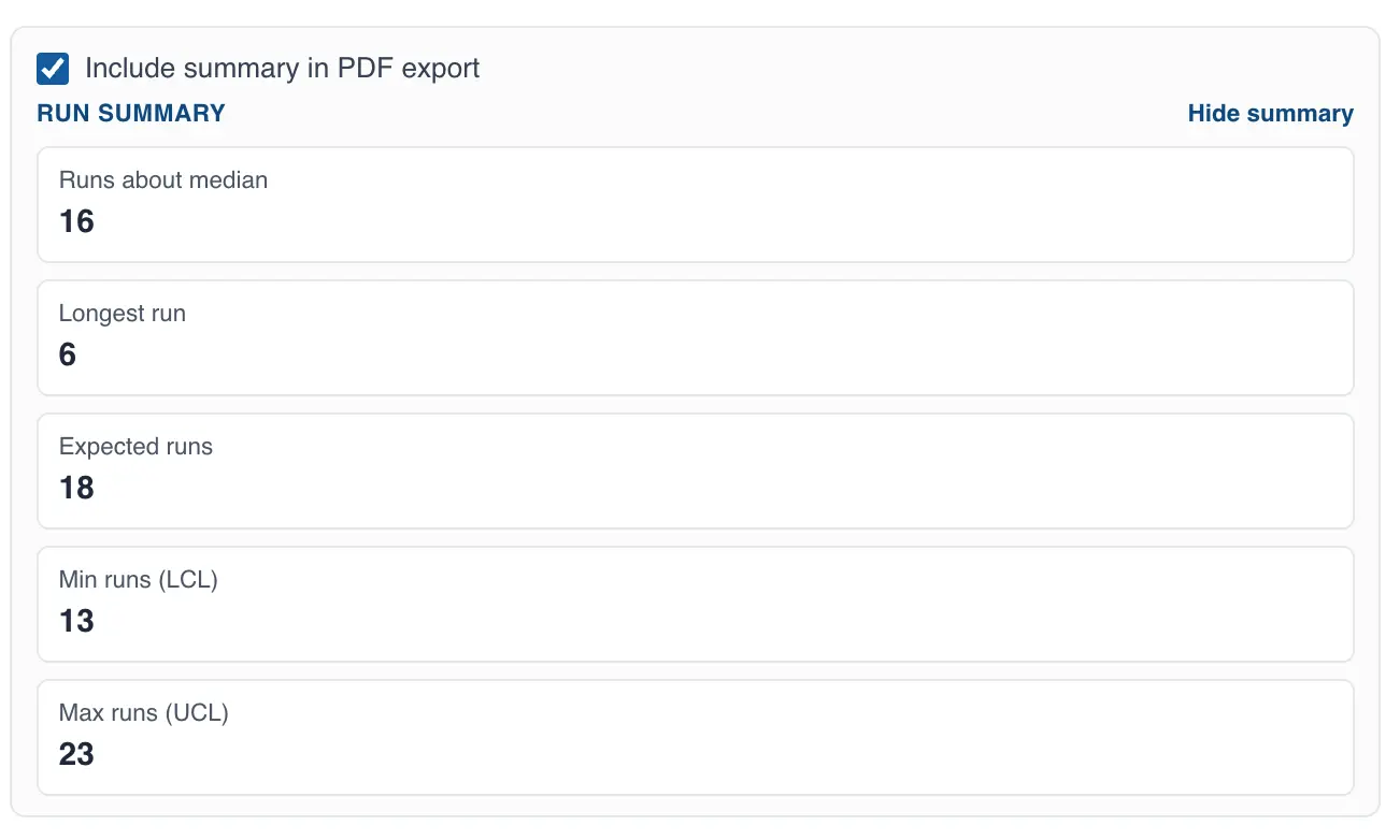
QSuite displays a statistical summary showing the total number of runs in the chart, the expected number of runs, and the maximum and minimum bounds. For the example above, a total of 16 runs is observed, and the expected range for that dataset is between 13 and 23 runs, with a mean of 18.
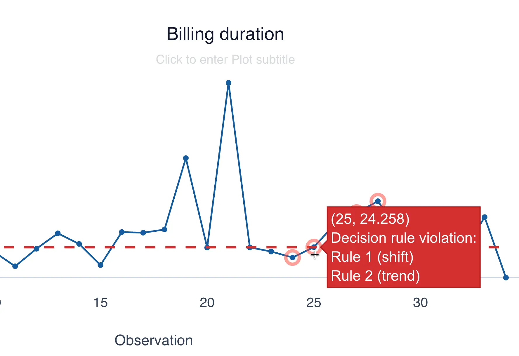
QSuite automatically identifies patterns or deviations in the chart. When a deviation is detected, QSuite marks the points forming the pattern with a red circle. Hovering over the red circle will show you which deviations were found.
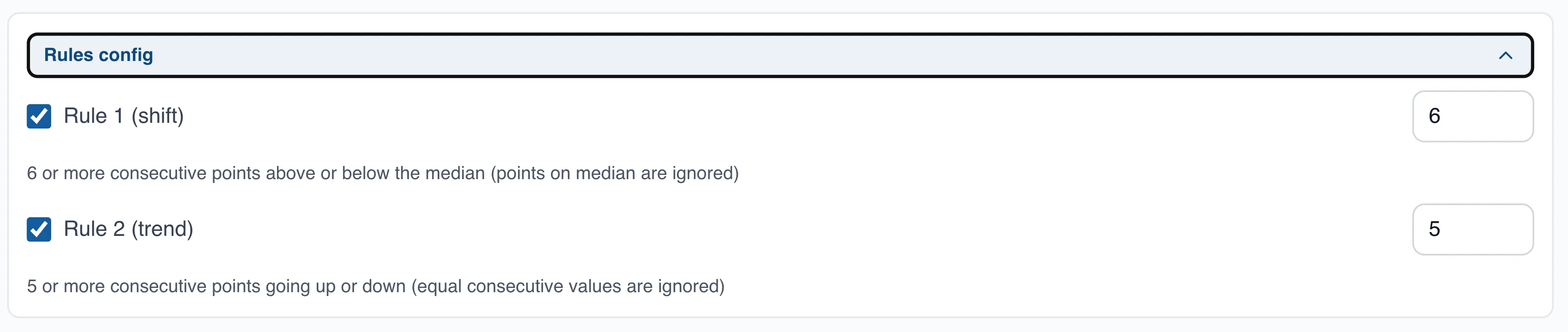
Configuring run chart rules
By default QSuite applies the following rules to flag deviations:
- Shift rule: triggered when 6 or more consecutive points fall above or below the median (long run)
- Trend rule: triggered when 5 or more consecutive points are continuously increasing or decreasing
In the "Rules Configuration" section you can disable either rule by clicking its checkbox. You can also modify the number of consecutive points required to trigger each rule.
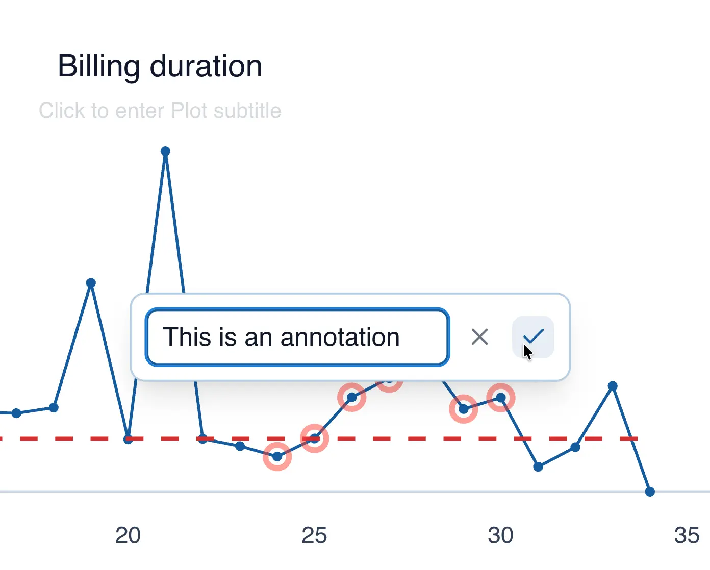
Creating annotations in the run chart
You can add comments to a data point by following these steps:
- Click on the data point you want to annotate
- From the menu, select "Annotate point"
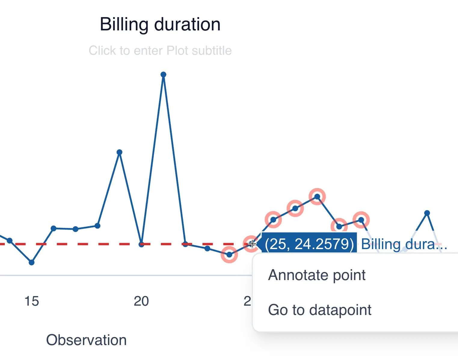
- Add your comment and click the checkmark to save
Line or Trend Chart
You can create a line chart from the menu bar or by dragging the column you want to analyze to the analysis panel.
Creating the line chart from the menu bar
- Click on "Create Analysis"
- Go to the "Create Chart" option
- Select the line chart from the dropdown list
- In the "Values" section, drag the column you want to chart.
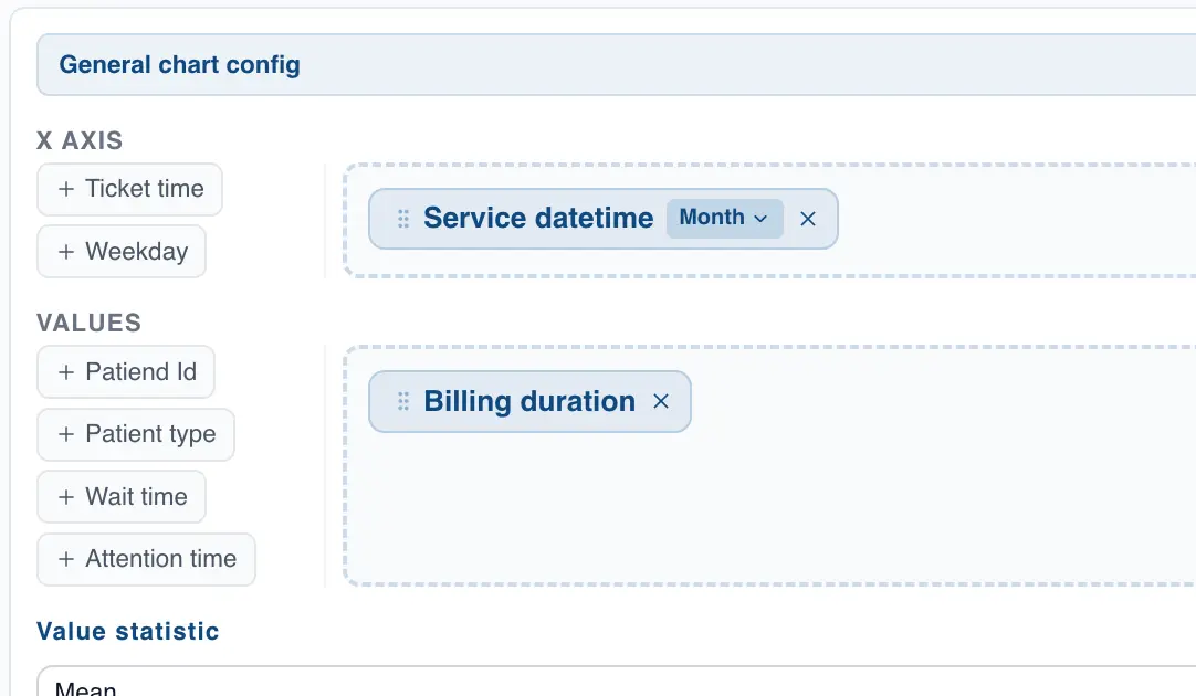
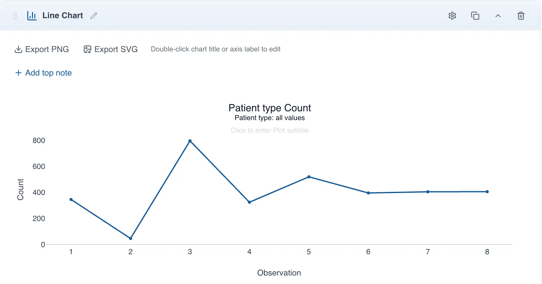
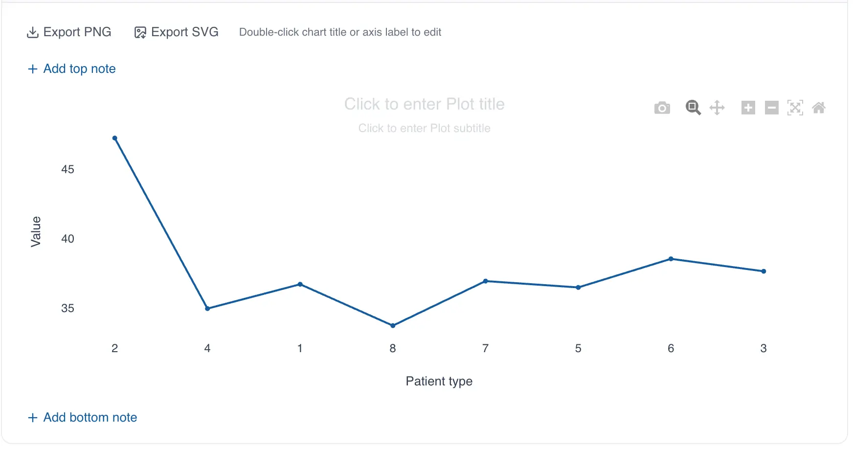
- If the selected column is categorical (text), QSuite will create the line chart automatically. Each unique value in the selected column will appear as a category. For example, the following chart was created using the categorical column "Patient type", where the patient type number is stored as text:
- If the column is numeric, QSuite will plot each individual observation. With many observations, as shown in the image below, the chart can be difficult to interpret.
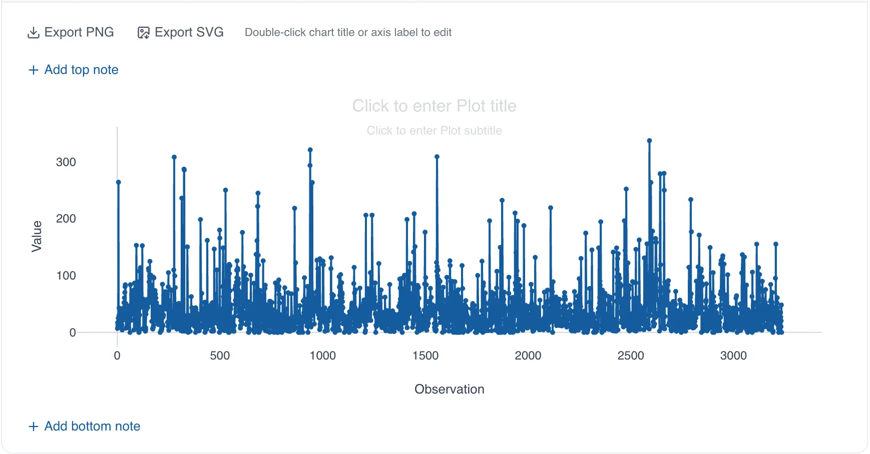
To resolve this, group the observations. Click "group observations by" on the selected column label to specify a grouping variable.
The grouping variable creates the different categories in the trend chart based on the values it contains. For example, the following chart shows the average billing time (numeric column) grouped by patient type (grouping variable):
Creating the line chart using drag and drop
- Drag the column you want to analyze to the analysis panel
- Drop the column on the area labeled "Line Chart"
QSuite will create the chart automatically.
To finish configuring the chart, follow steps 5 and 6 above.
Grouping dates in the line chart
In QSuite you can group your data using date columns, letting you select date components such as month, quarter, day, and others.
The available options are:
- By year
- By quarter
- By month
- By week number
- By day of the week (Monday, Tuesday, etc.)
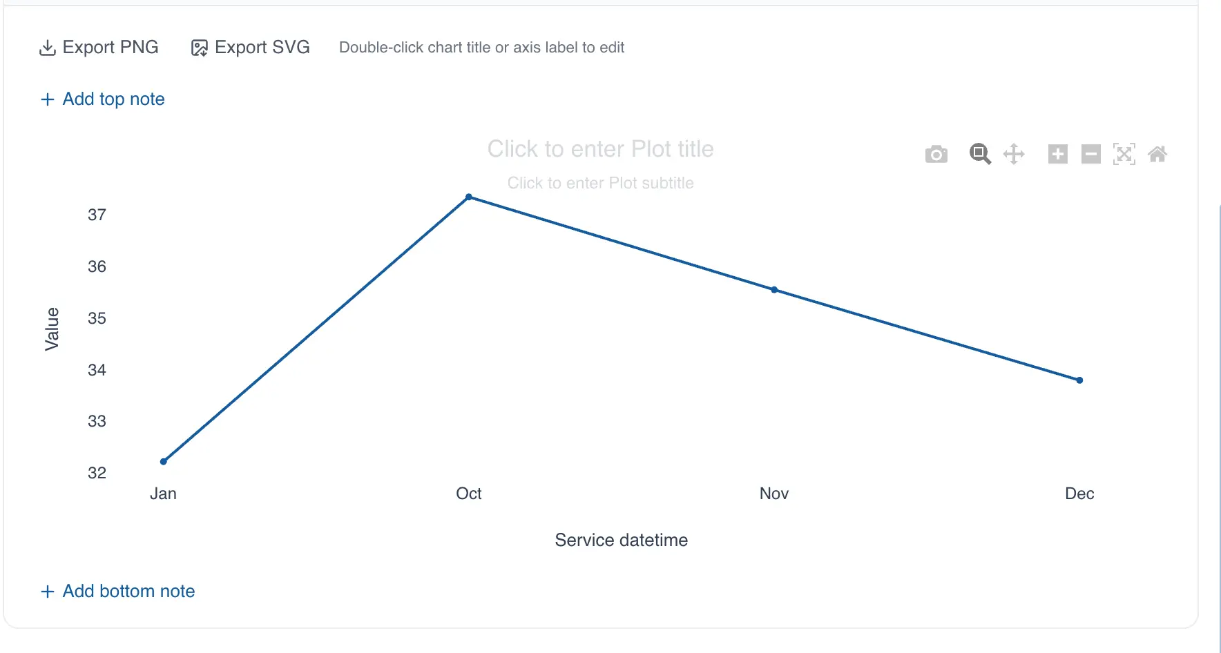
If you select monthly grouping, QSuite automatically configures the chart to display your data month by month, as shown in the image below.
Selecting the summary statistic in the line chart
When the selected column is categorical, QSuite uses count as the default summary statistic. The available statistics for categorical data are:
- Count: counts the total observations for each category in the selected column or grouping column
- % of total: calculates the percentage of each category based on the total observations in the entire data column
- % within group: calculates the percentage of each category using the total observations within that same category as the base
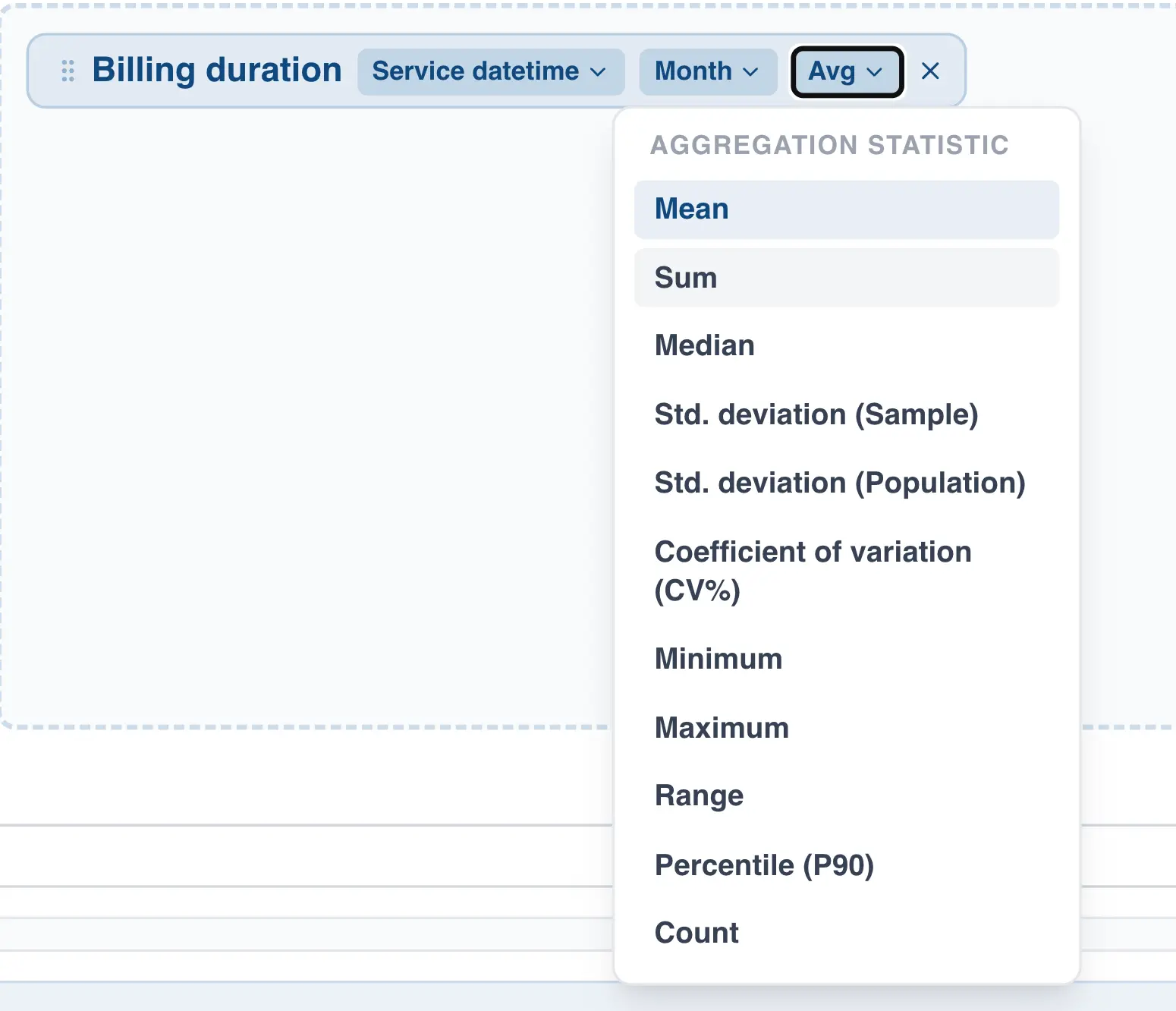
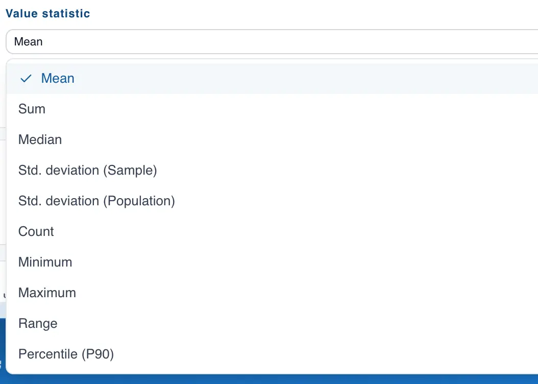
When the selected column is numeric, QSuite uses the mean as the default summary statistic. You can change it in the "Values statistic" section, as shown below:
Adding reference lines to the line chart
You can add as many reference lines as you want by following these steps:
- If it is not already open, open the chart configuration panel by clicking the gear icon
- In the "Display Settings" section, enable the "Show reference lines" option
- Add the reference lines you want
Heat Map
The heat map is a visualization tool that uses color gradients to represent magnitudes in a matrix. It is a powerful tool for identifying "hot spots" — matrix cells with intense color that indicate high concentration or the presence of outliers.
Creating the heat map from the menu
- Click on "Create Analysis"
- Go to the "Create Chart" option
- Select the heat map from the dropdown list
- Drag a categorical or date column to the X axis
- Drag a categorical or date column to the Y axis
- Drag a numeric (decimal or integer) or categorical column to the "Values" section
Creating the heat map using drag and drop
- Drag a column to the analysis panel
- Drop the column on the area labeled "Heat Map"
When you drop the column, QSuite automatically places it in the "Values" section.
- Drag a categorical or date column to the X axis
- Drag a categorical or date column to the Y axis
Interpreting the heat map
The heat map is straightforward to interpret. After building the chart, you will notice that the matrix cells have different color shades and intensities. Redder colors indicate higher numbers, while bluer colors indicate lower numbers.
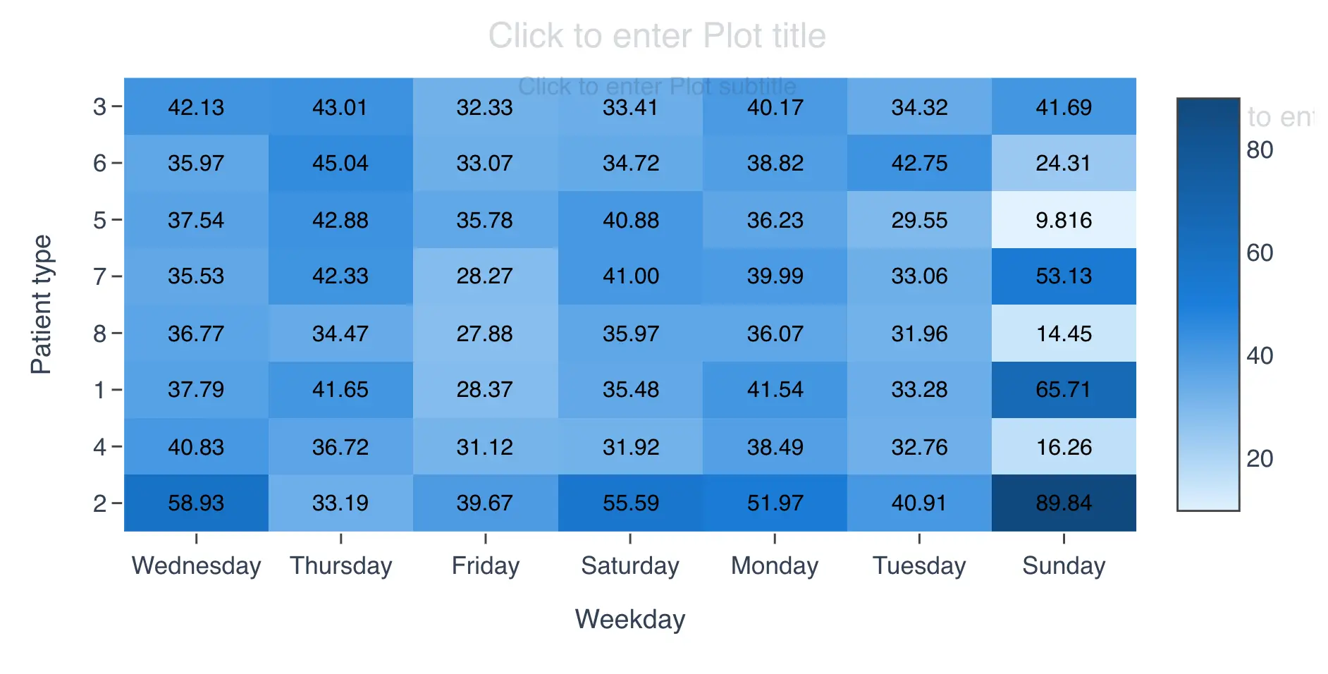
For example, the following heat map was built using "Patient type" on the Y axis, "Weekday" on the X axis, and "Billing duration" as the "Values" column.
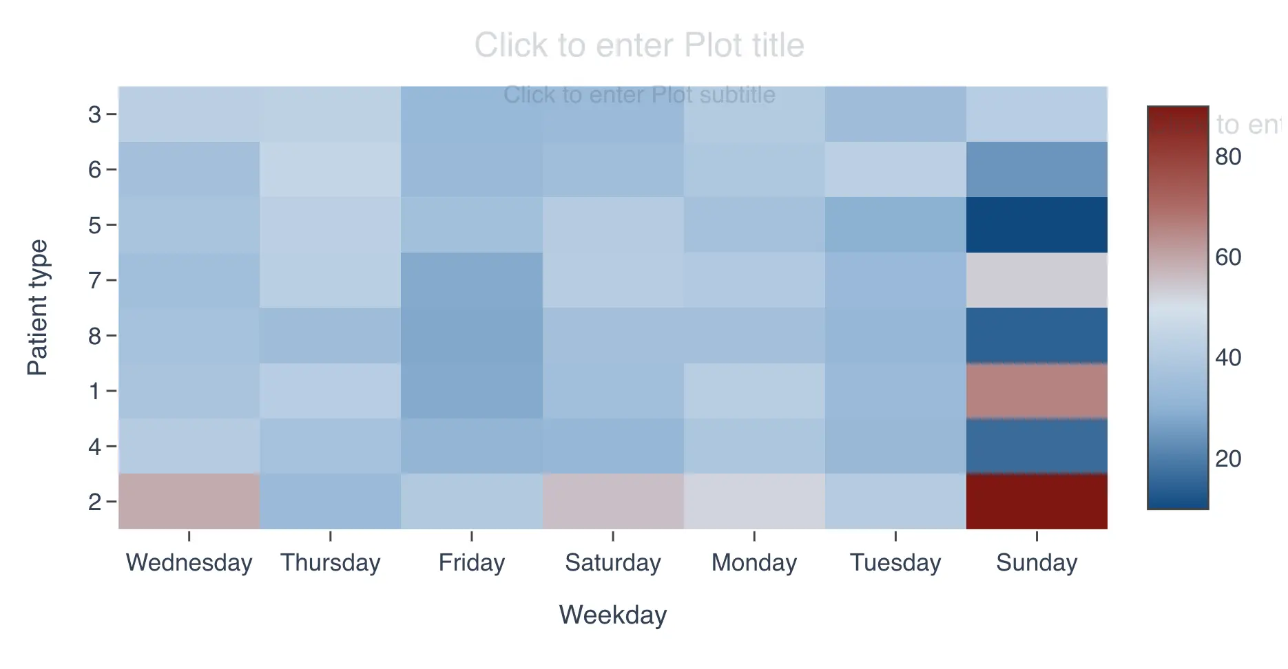
The chart shows that the cell at the intersection of "Sunday" and patient type "2" is red, meaning the average "Billing duration" is highest for the combination of Sunday and patient type 2.
At the intersection of "Sunday" and patient type "5", an intense blue appears, meaning the average "Billing duration" is lowest for the combination of Sunday and patient type 5.
In short, deeper red means a higher average in that cell, while deeper blue means a lower average.
Working with dates in the heat map
The heat map supports date columns for the X and Y axes. This is a convenient feature that lets you summarize your data by date periods such as month, year, week, and others, without needing to create an additional column. To use this feature, follow these steps:
- Drag the date column to the X or Y axis
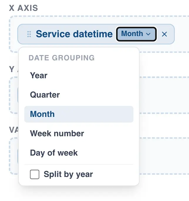
- A dropdown will appear next to the column name
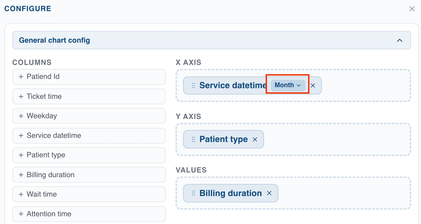
- Click the dropdown to view the available date grouping options
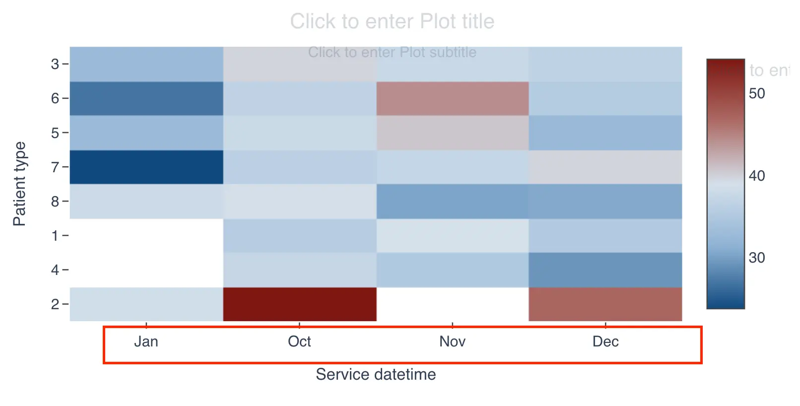
After selecting one of these options, QSuite will automatically group the data and display it in the chart. The following image shows the heat map with the X axis grouped by month.
Setting the summary statistic in the heat map
When you first create a heat map, QSuite uses either the observation count or the mean depending on the type of variable selected in the "Values" section.
If you add a categorical or date column in the "Values" section, QSuite defaults to the observation count as the summary statistic, with the option to switch to percentage. For these column types, count and percentage are the only available statistics.
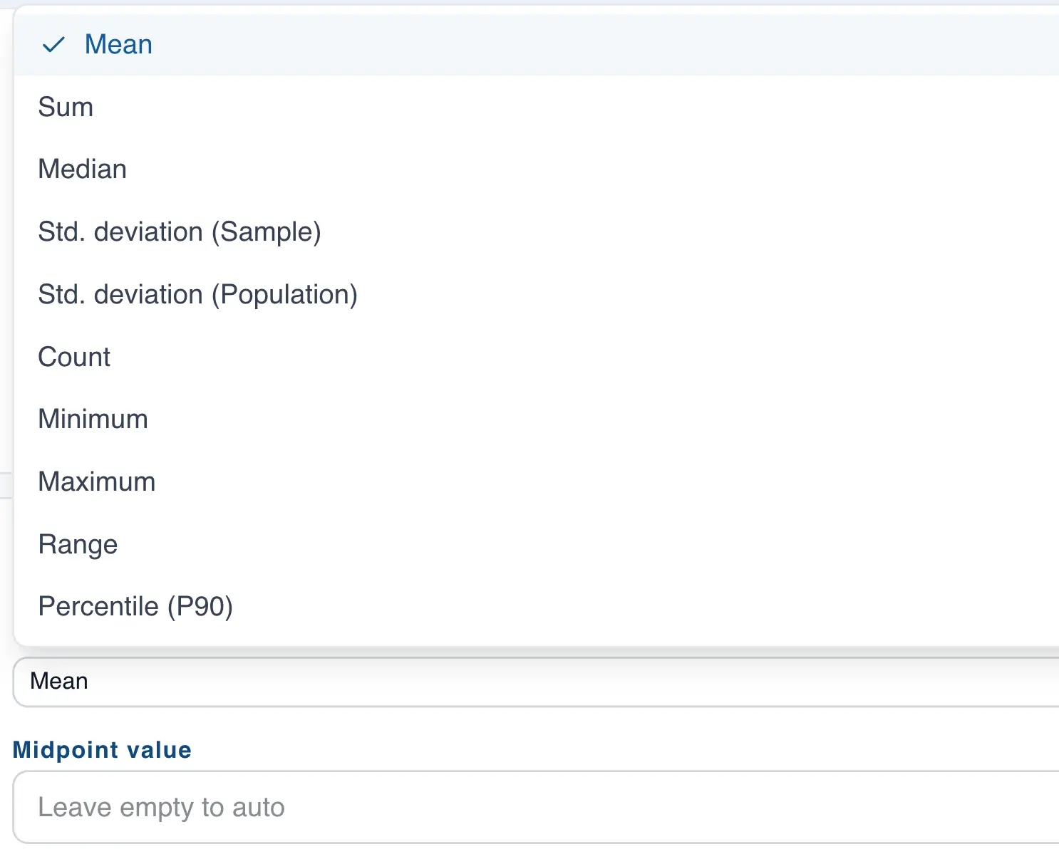
When you add a decimal or integer column in the "Values" section, QSuite defaults to the mean. To change the statistic, follow these steps:
- If it is not already open, open the chart configuration panel by clicking the gear icon located at the far right of the analysis header
- In the "General Settings" section, go to the column in the "Values" section
- Click the dropdown that appears on the column label
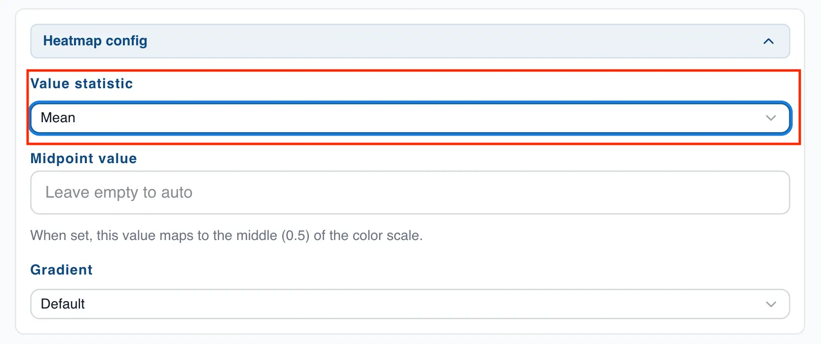
- Choose the statistic you want to use for the chart
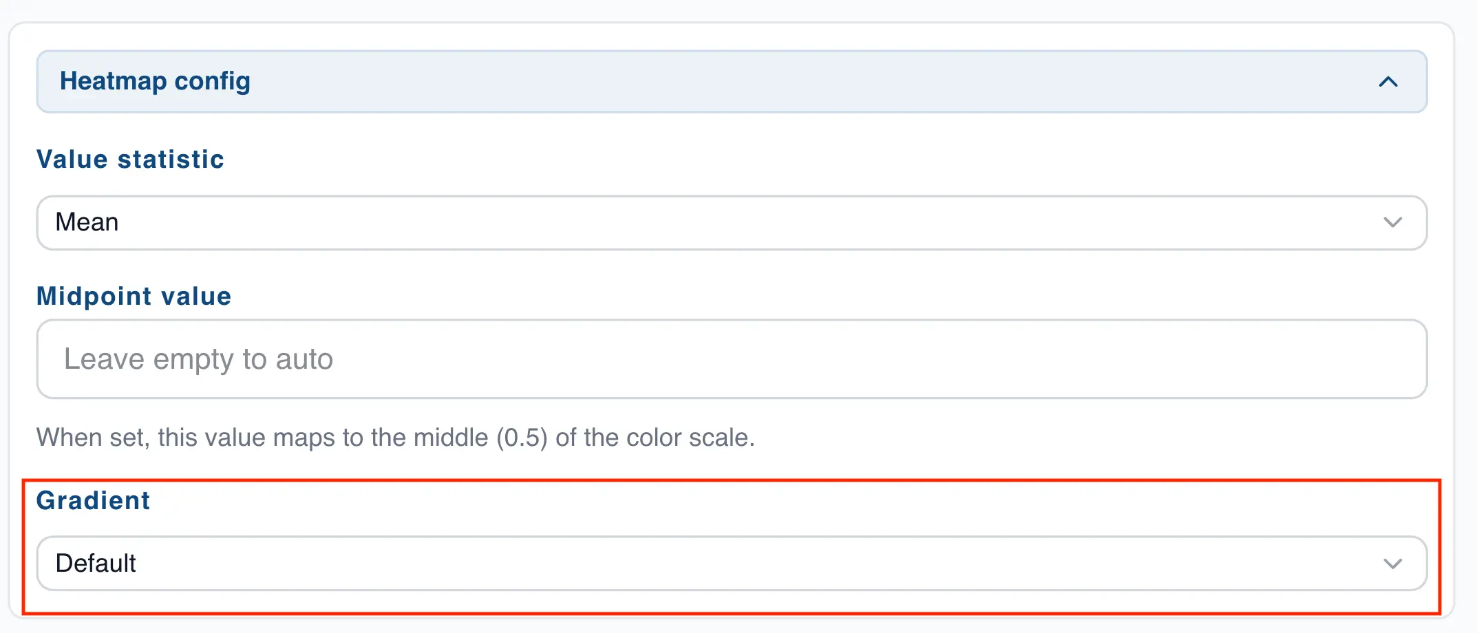
Changing the midpoint value of the heat map
By default QSuite uses the center of the observations as the midpoint value for building the intensity scale. You can customize this value by following these steps:
- If it is not already open, open the chart configuration panel by clicking the gear icon located at the far right of the analysis header
- In the "Heat Map Settings" section, you will find a field labeled "Midpoint value".
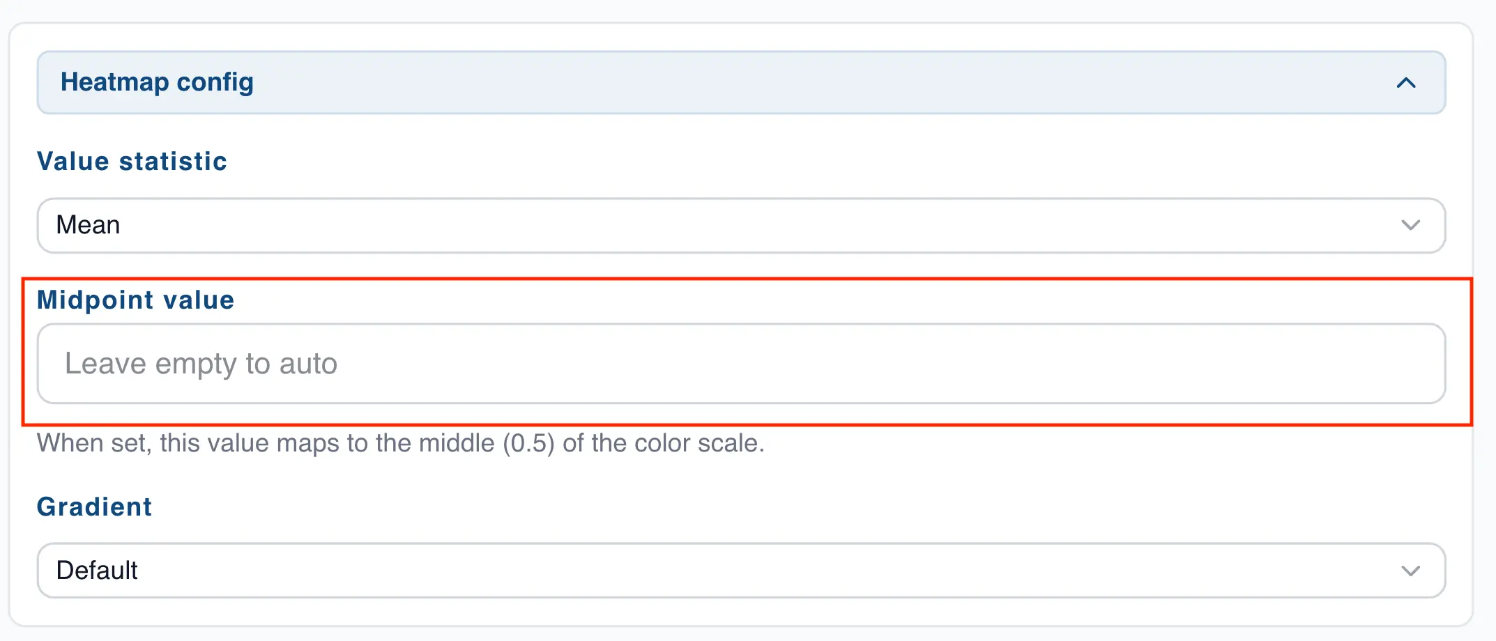
- Enter the value you want in this field
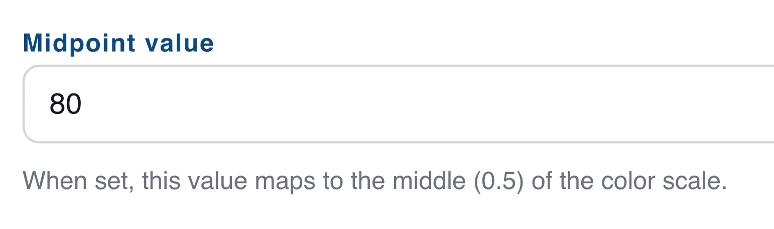
Notice how the color intensities change when you adjust the midpoint value. The following two charts show an example with the default midpoint and another with a custom midpoint of 80.
Heat map with default midpoint value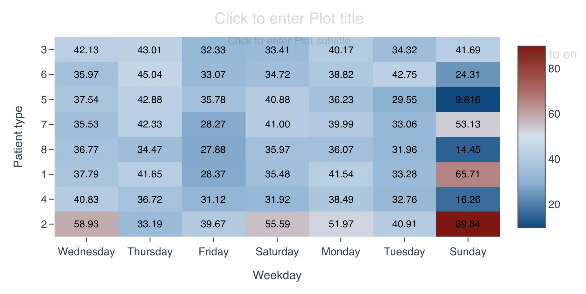
Heat map with custom midpoint value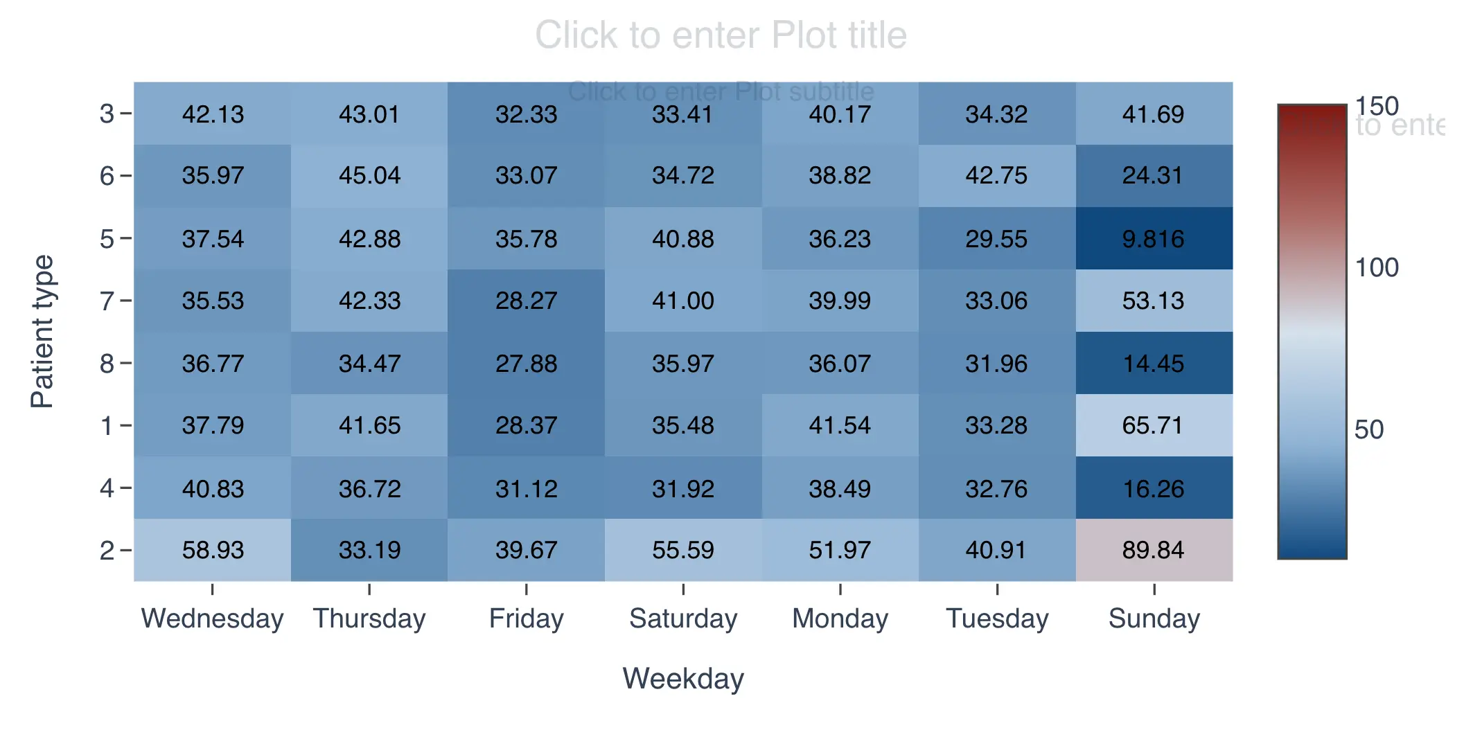
Heat map color configuration
By default QSuite uses two colors to build the heat map:
- Red for larger numbers
- Blue for smaller numbers
You can switch to a single color if preferred. To change this, follow these steps:
- If it is not already open, open the chart configuration panel by clicking the gear icon located at the far right of the analysis header
- In the "Heat Map Settings" section, you will find a dropdown labeled "Gradient".
- Click the dropdown to view the available options
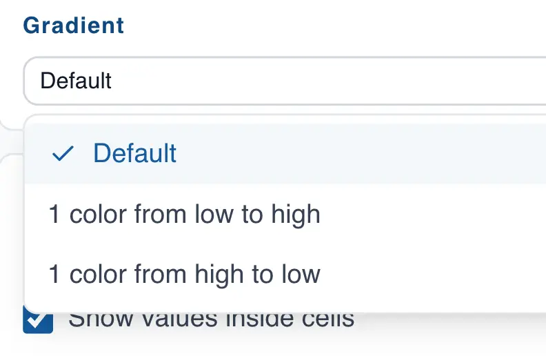
The available options are:
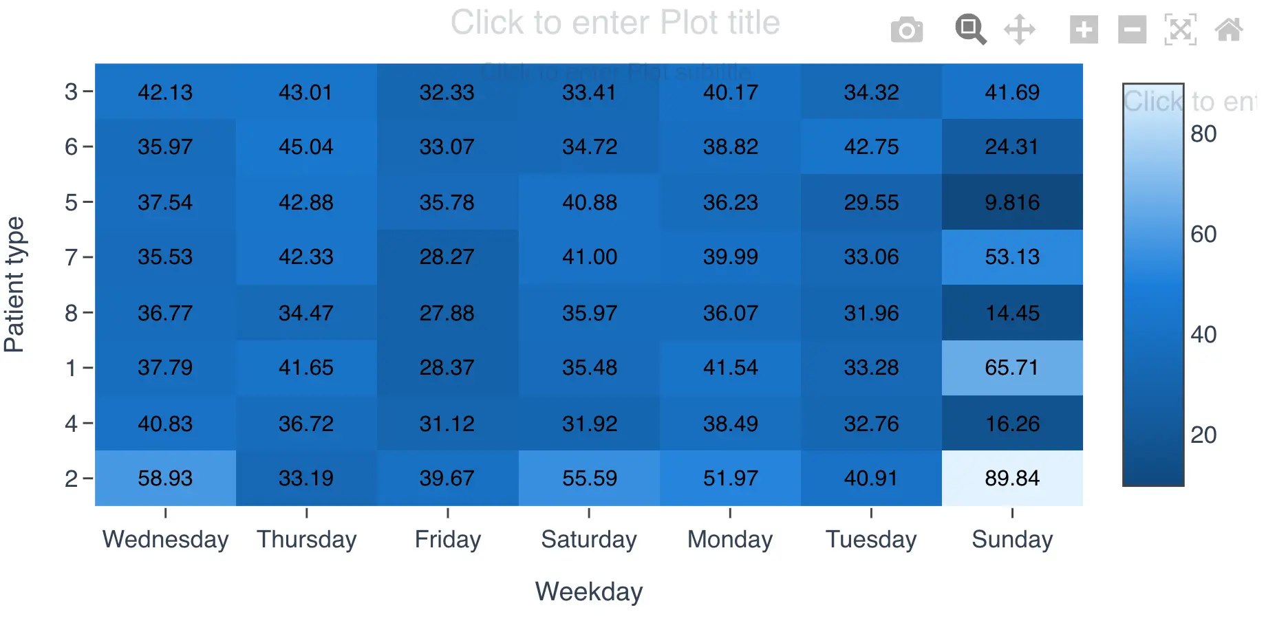
- 1 color from low to high intensity. The heat map will use blue, where lighter shades represent smaller numbers and darker shades represent larger numbers.
- 1 color from high to low intensity. The heat map will use blue, where lighter shades represent larger numbers and darker shades represent smaller numbers.
Displaying values in the heat map
By default QSuite does not show the value inside each cell, but you can change this setting easily:
- If it is not already open, open the chart configuration panel by clicking the gear icon located at the far right of the analysis header
- Go to the "Display Settings" section
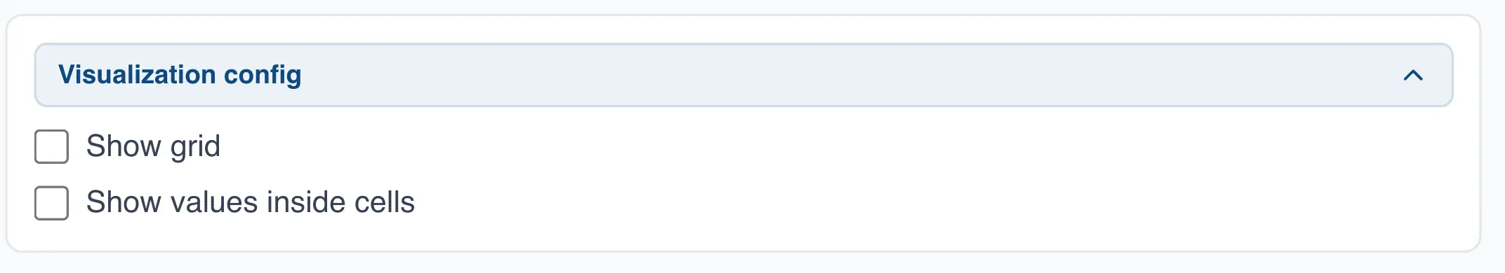
- Enable the checkbox labeled "Show values inside cells"